Here, I showcase a selection of my work as a graphic designer, where creativity meets strategy to bring visual identities and digital experiences to life. Design, for me, is more than aesthetics—it is a way to communicate ideas, connect with people, and create meaningful experiences.
My focus includes branding & identity, advertising design, web design, and UX design, each project reflecting a balance between functionality and visual impact. From logos and posters to websites and interactive prototypes, this portfolio represents the variety of skills and approaches I bring to every challenge.
I invite you to explore each section and discover how I transform concepts into designs that are not only visually appealing but also purposeful and memorable.
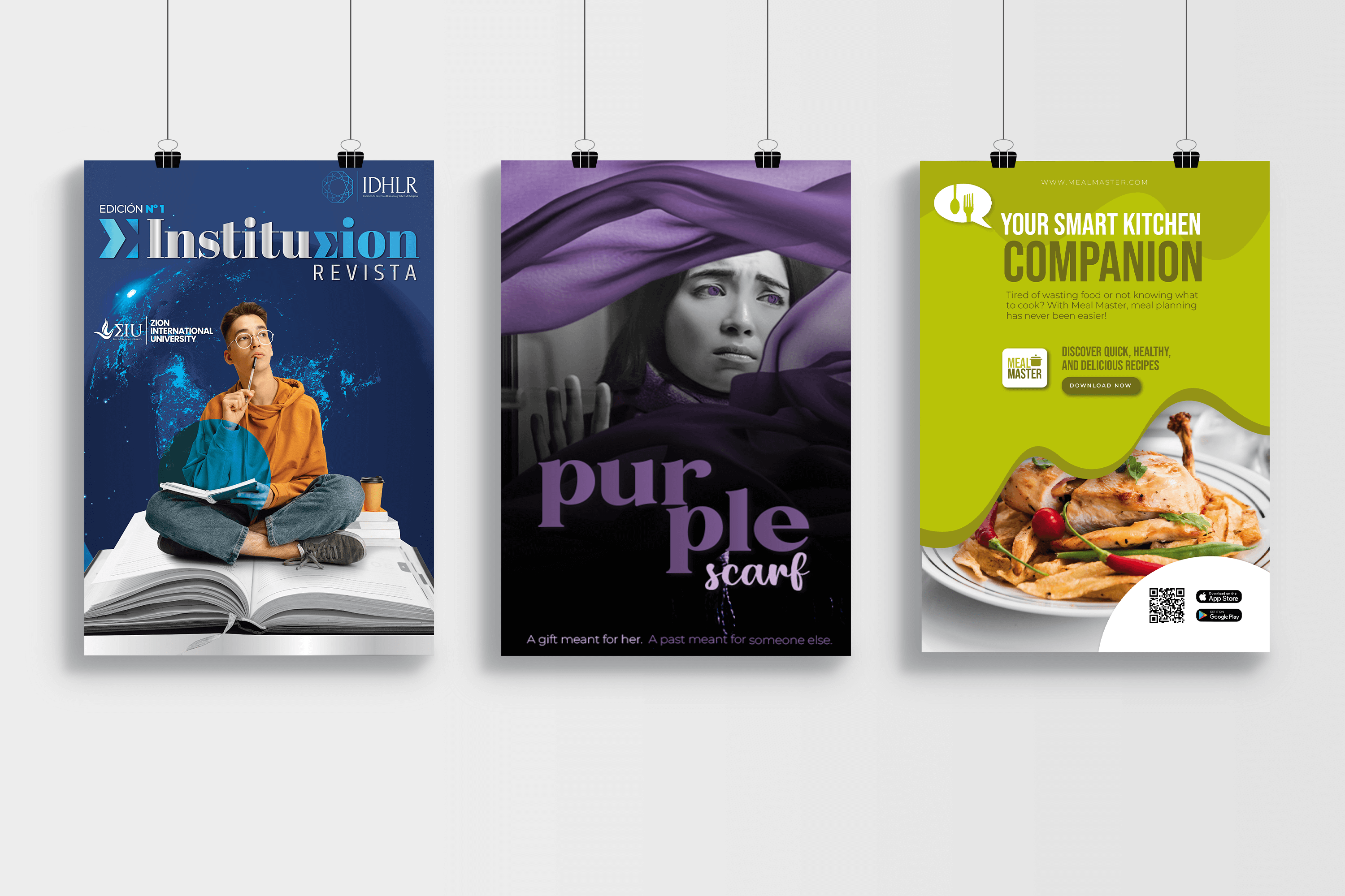
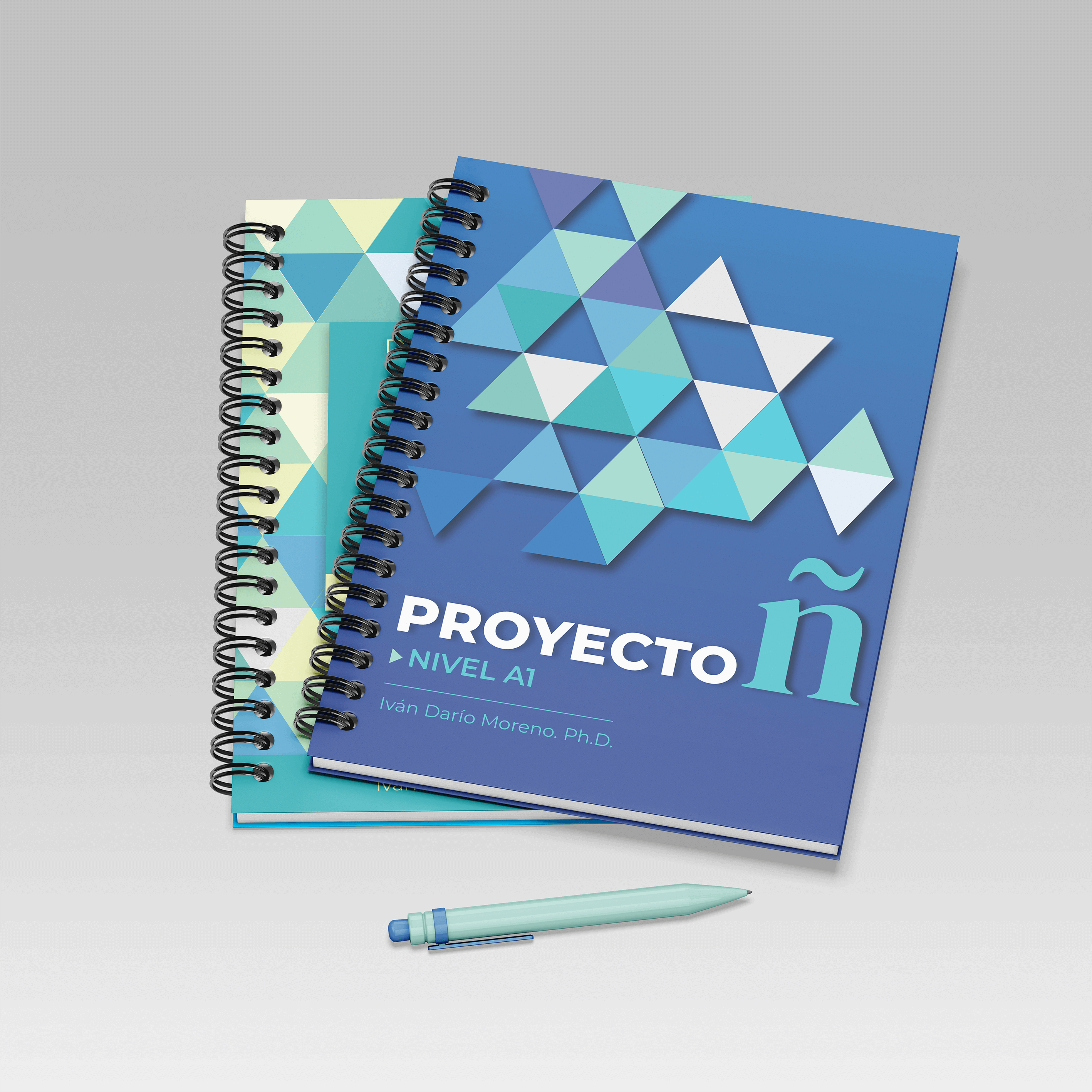
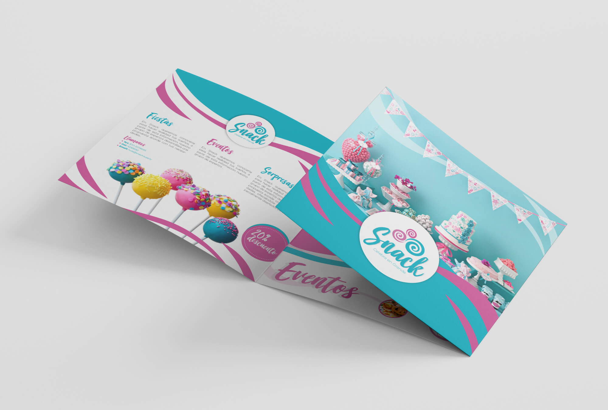
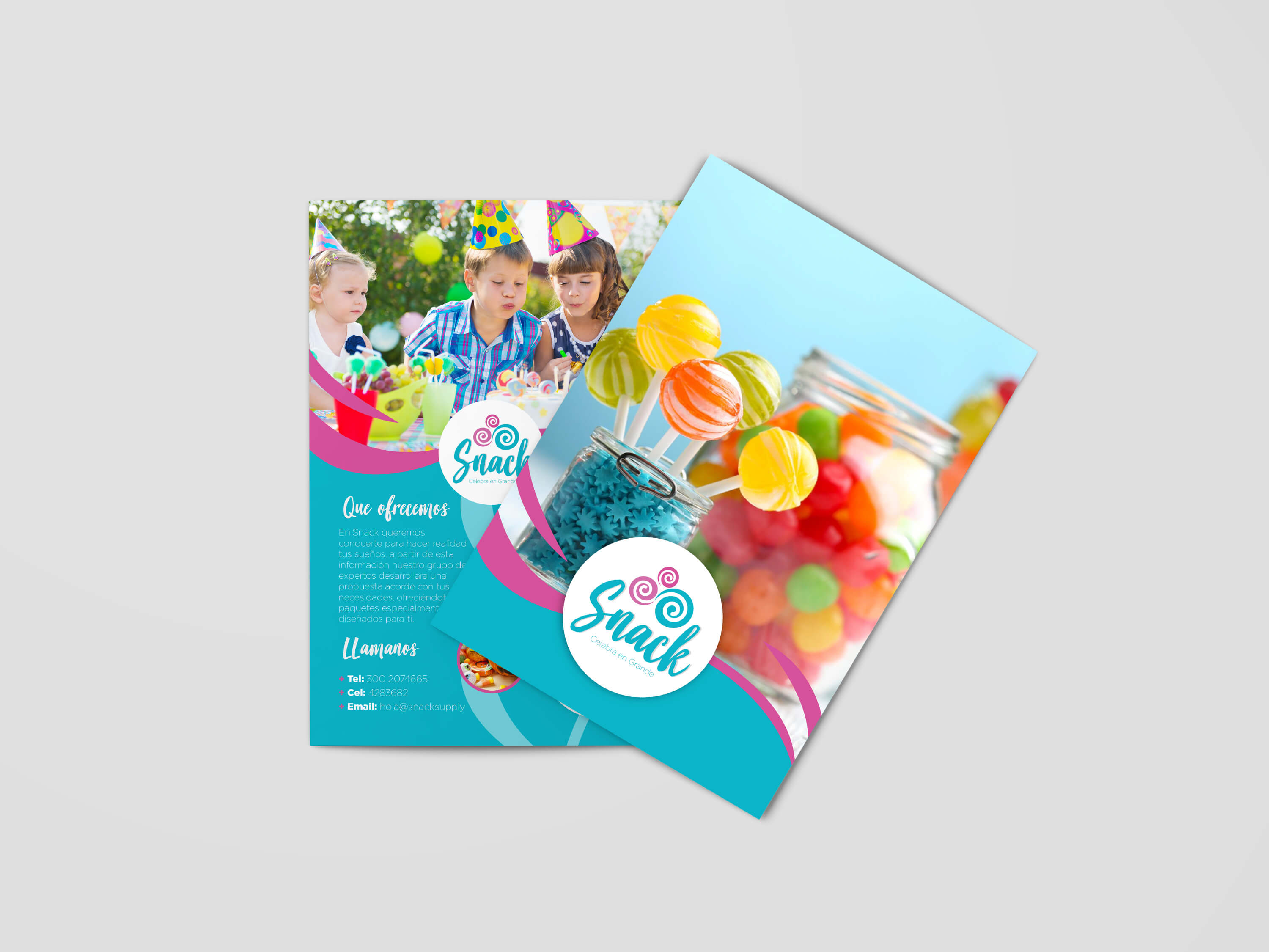
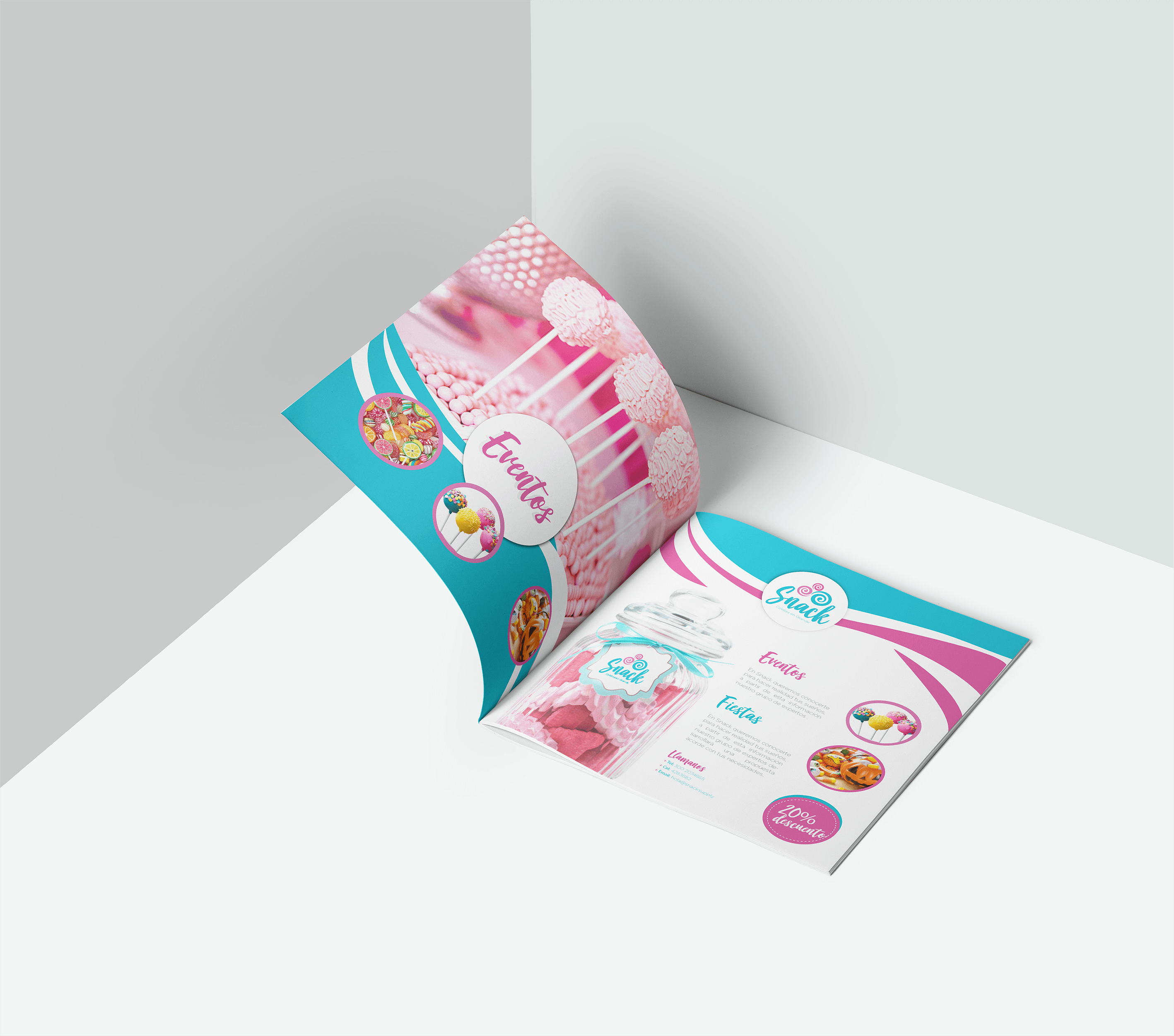
This section brings together projects focused on creating advertising pieces that are clear, creative, and effective. From posters and flyers to covers and campaigns, each design aims to connect with the audience, highlight the brand, and deliver the message in a strong visual way.
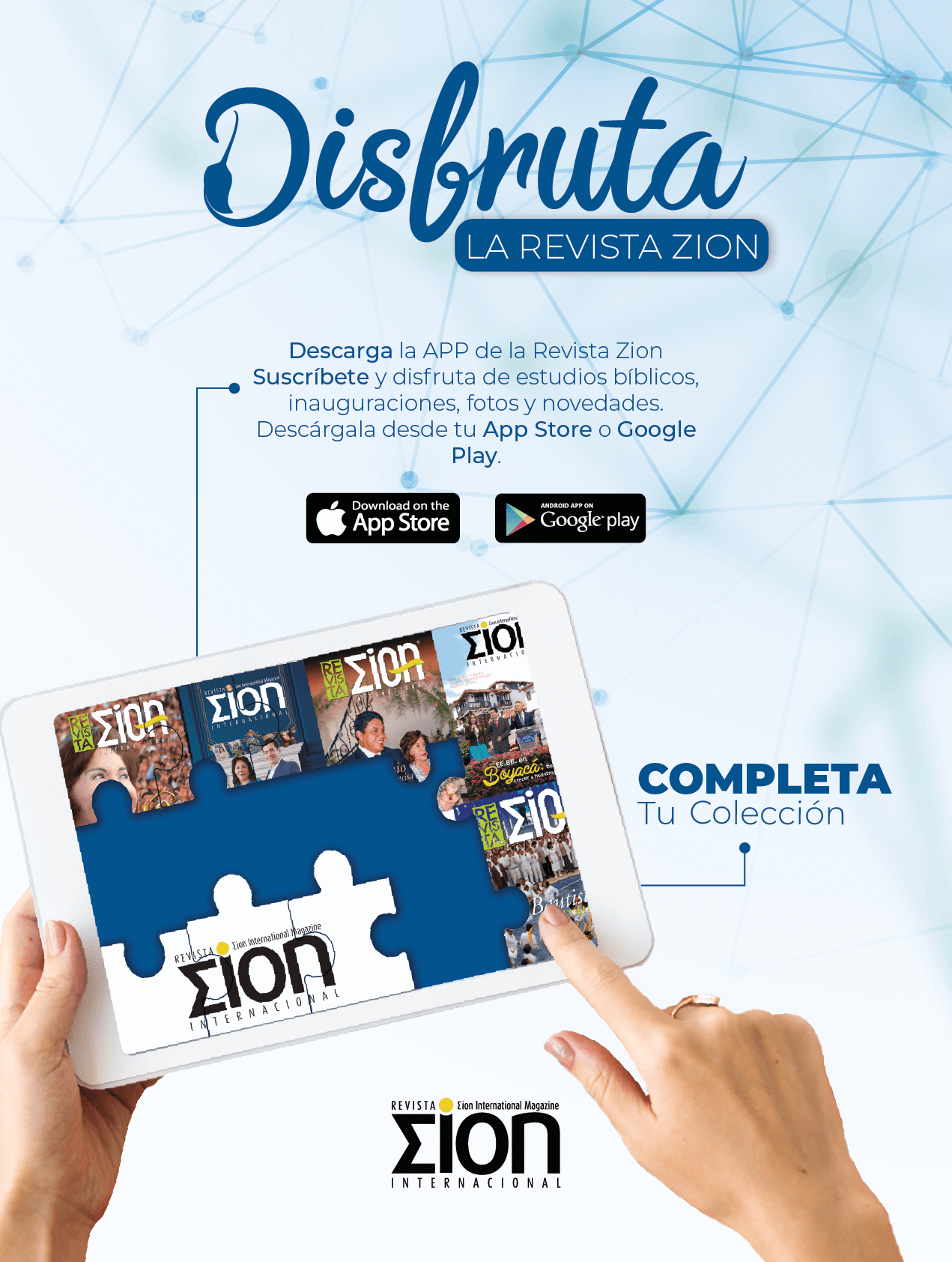
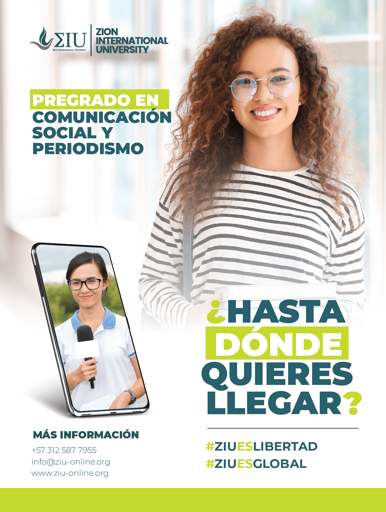
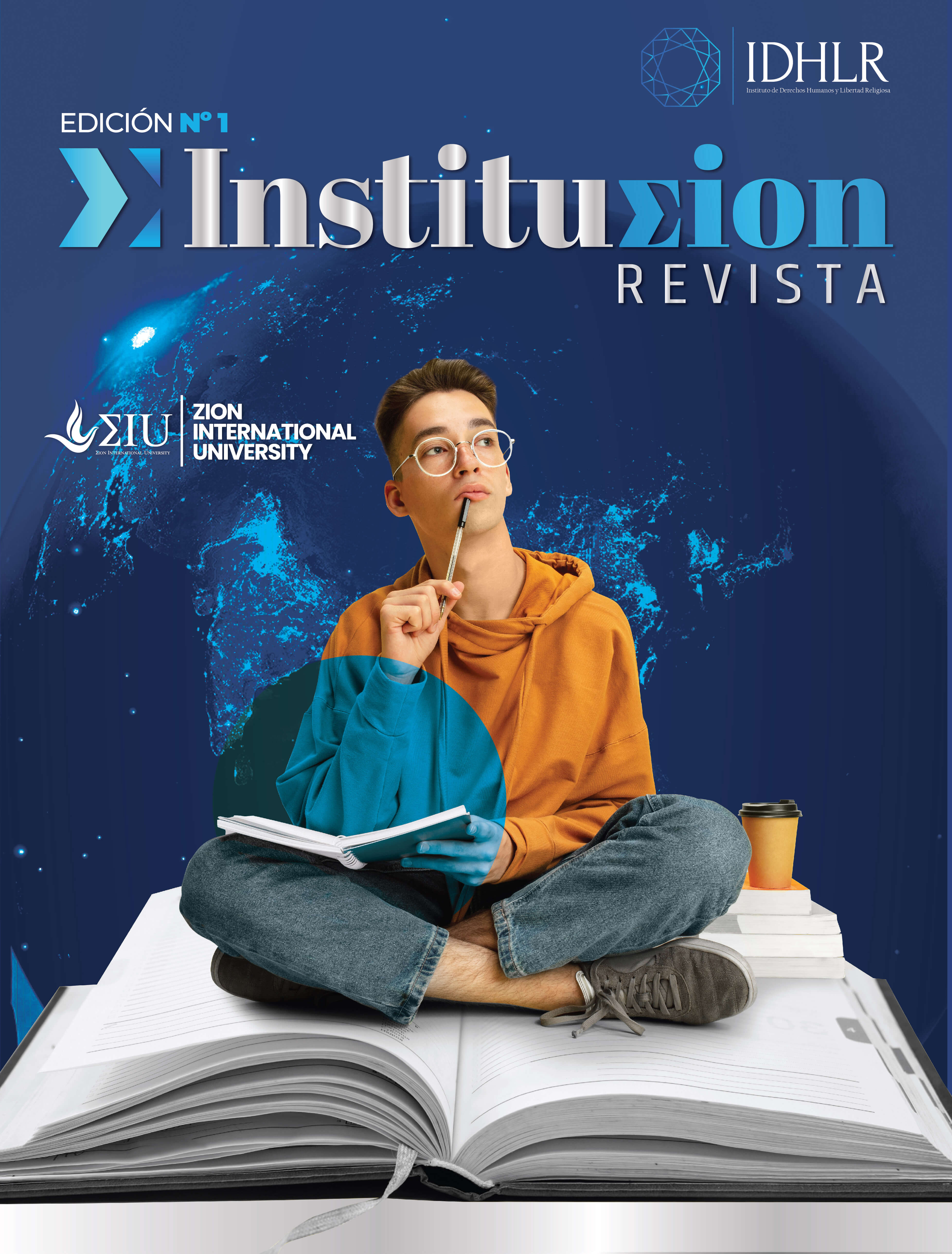
This section brings together projects focused on creating advertising pieces that are clear, creative, and effective. From posters and flyers to covers and campaigns, each design aims to connect with the audience, highlight the brand, and deliver the message in a strong visual way.
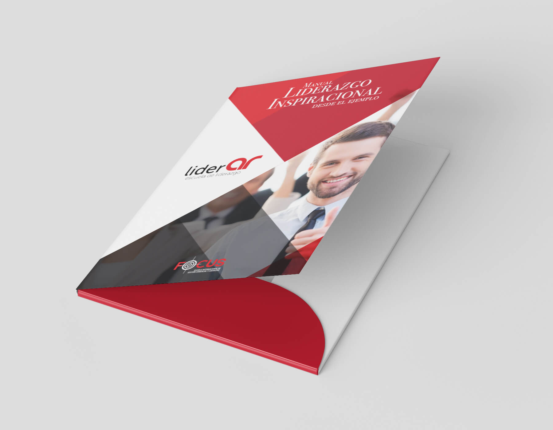
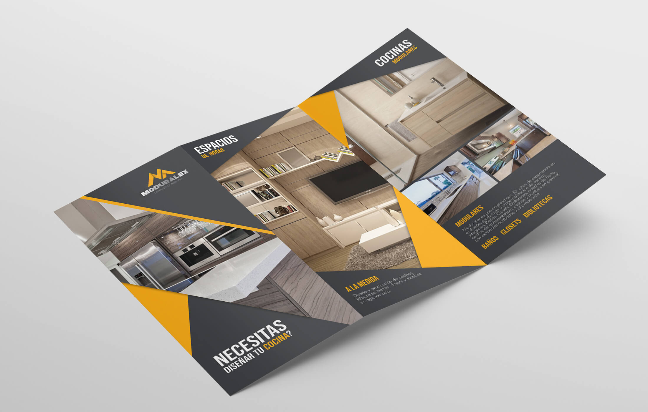
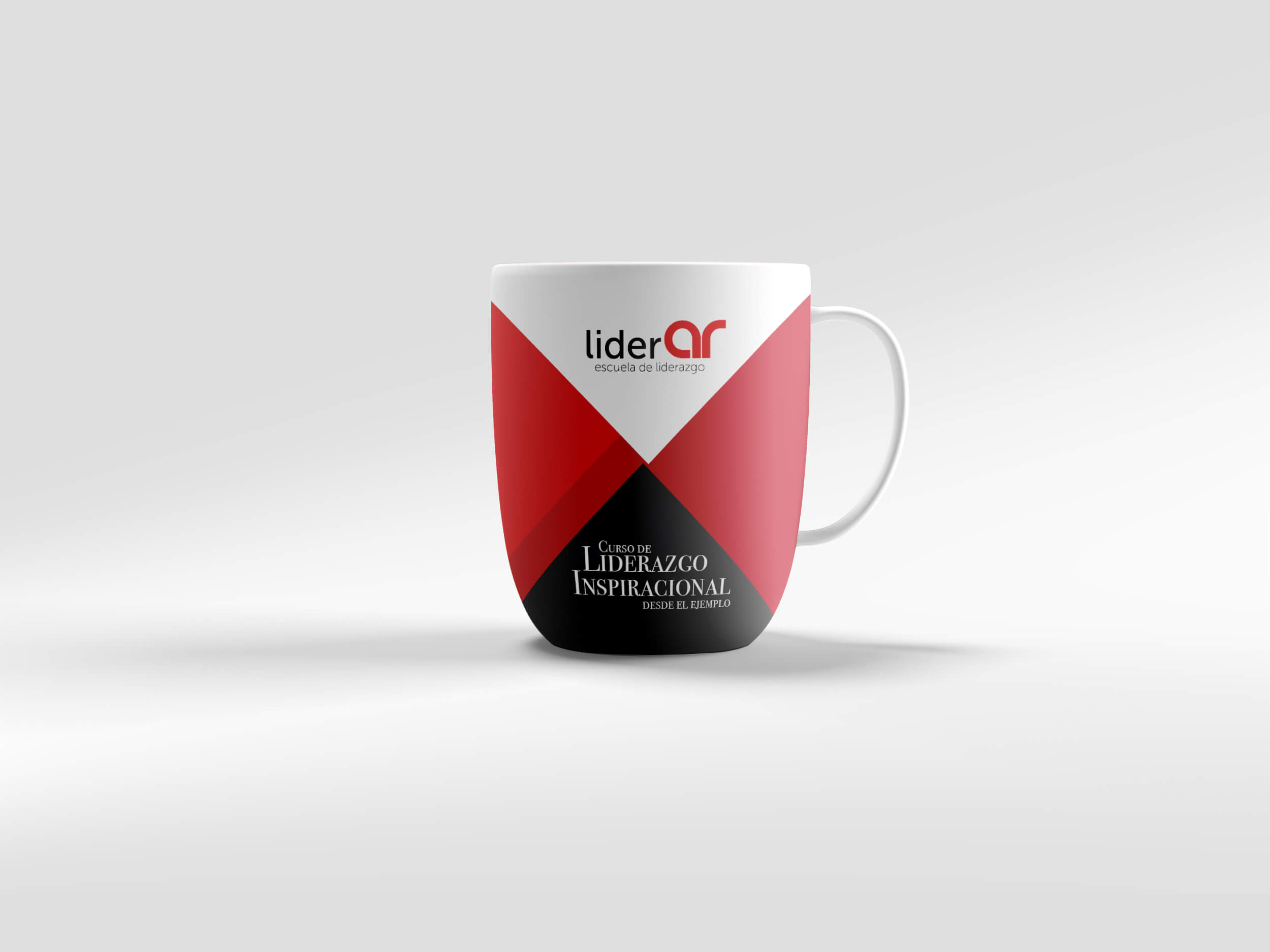
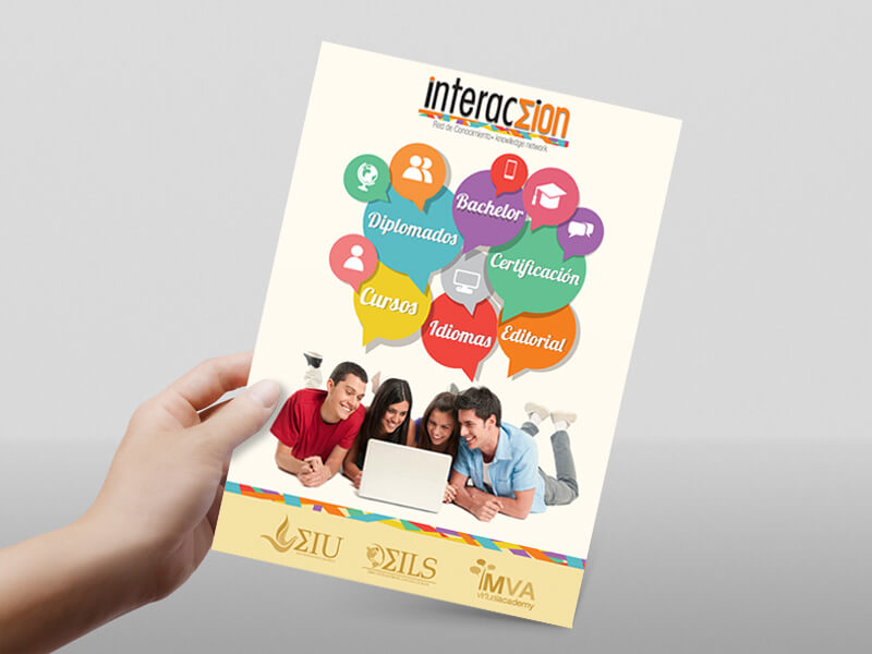
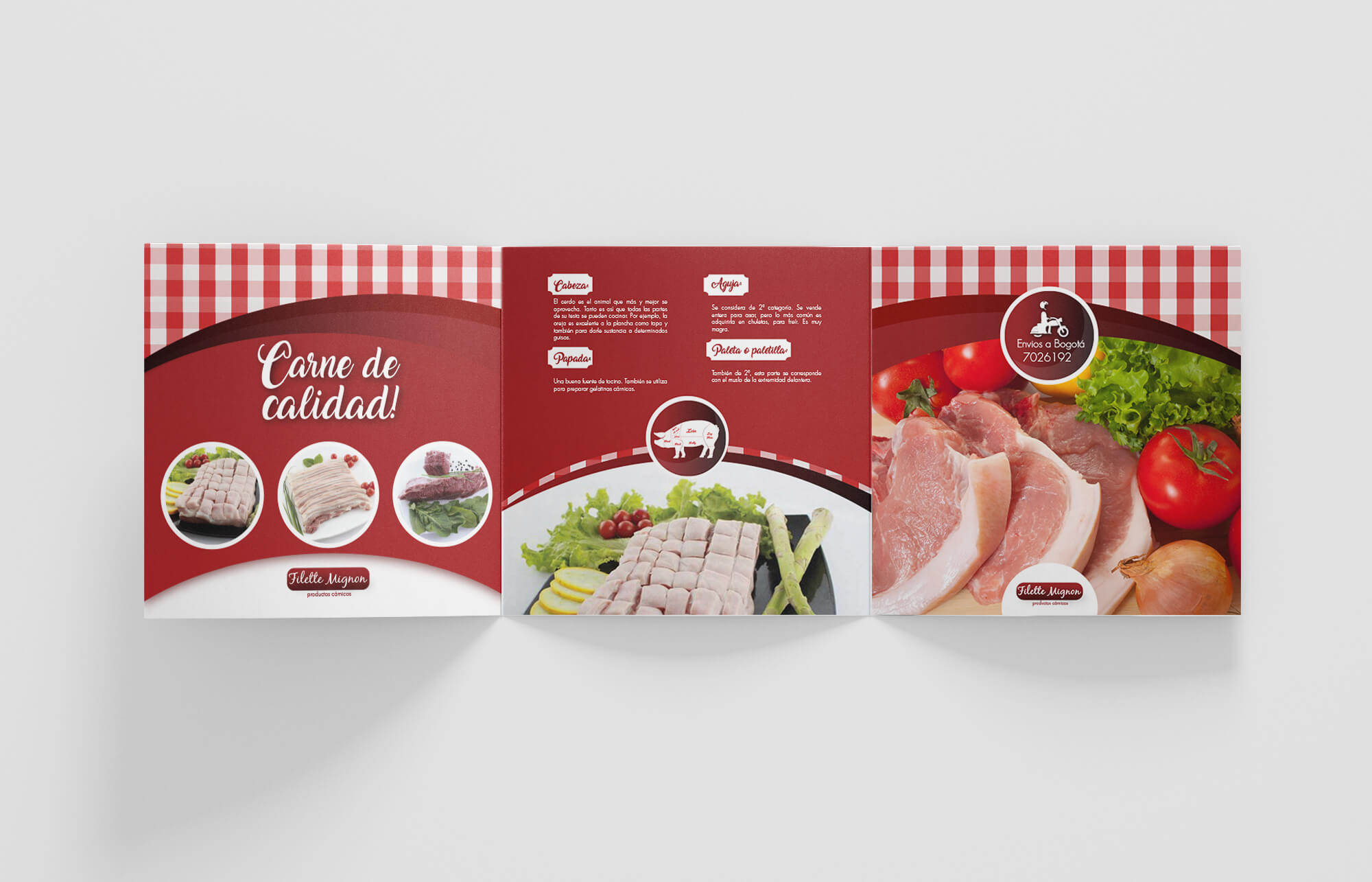
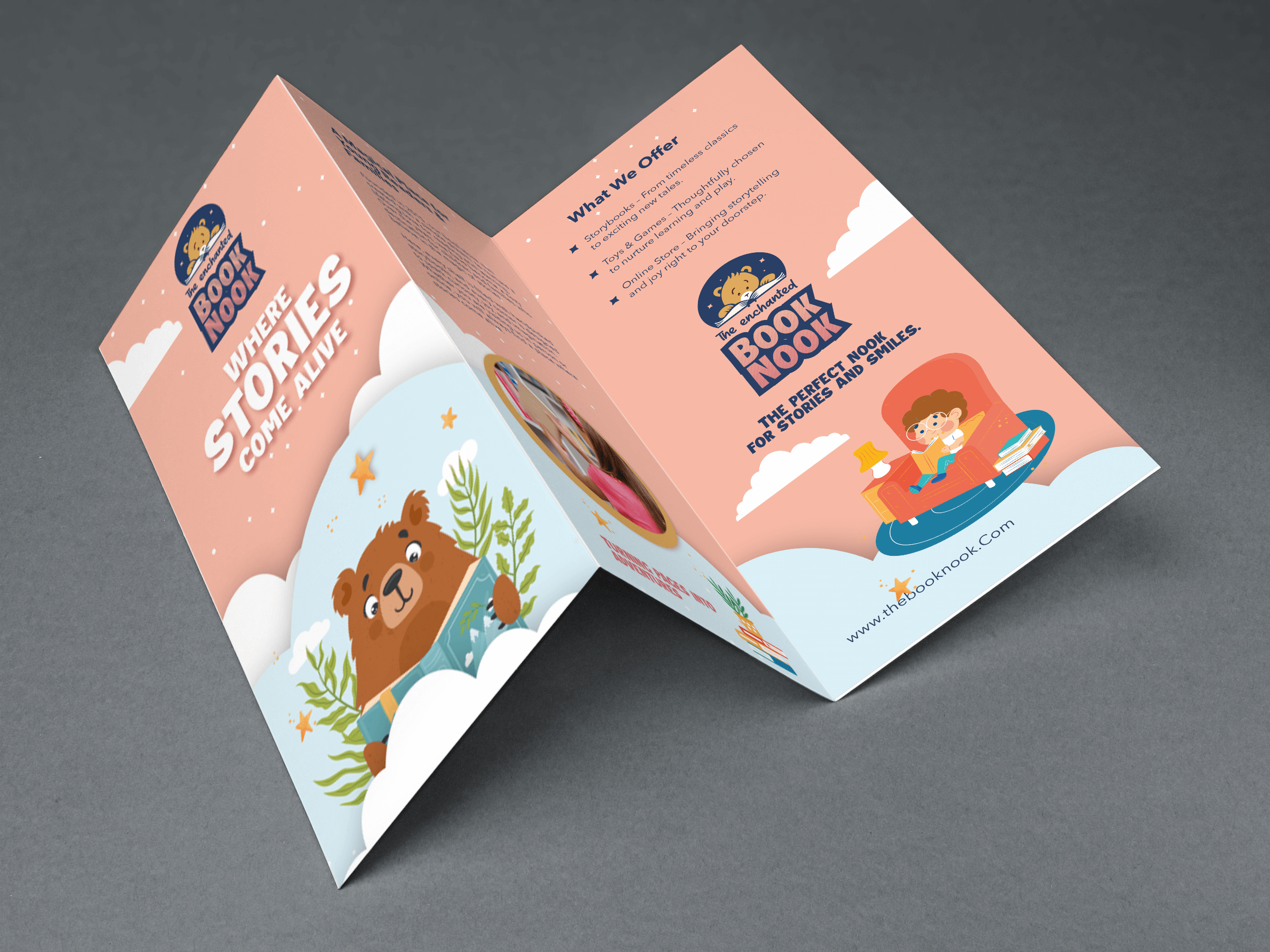
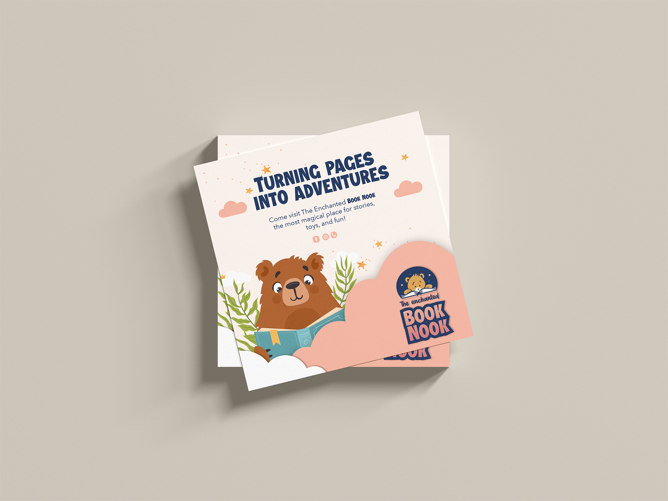
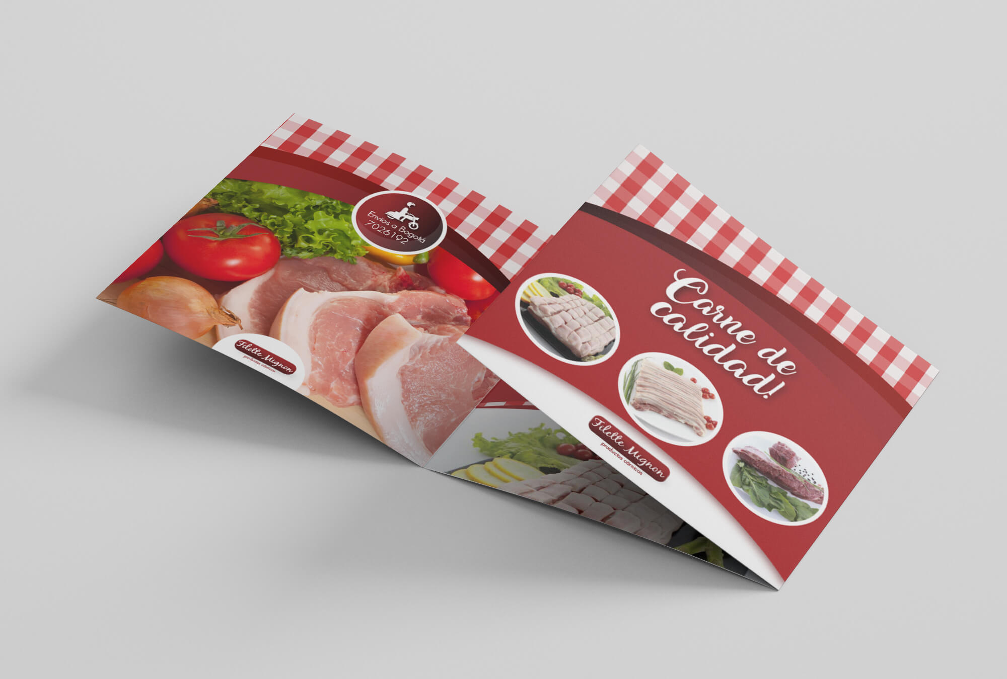
This section brings together projects focused on creating advertising pieces that are clear, creative, and effective. From posters and flyers to covers and campaigns, each design aims to connect with the audience, highlight the brand, and deliver the message in a strong visual way.
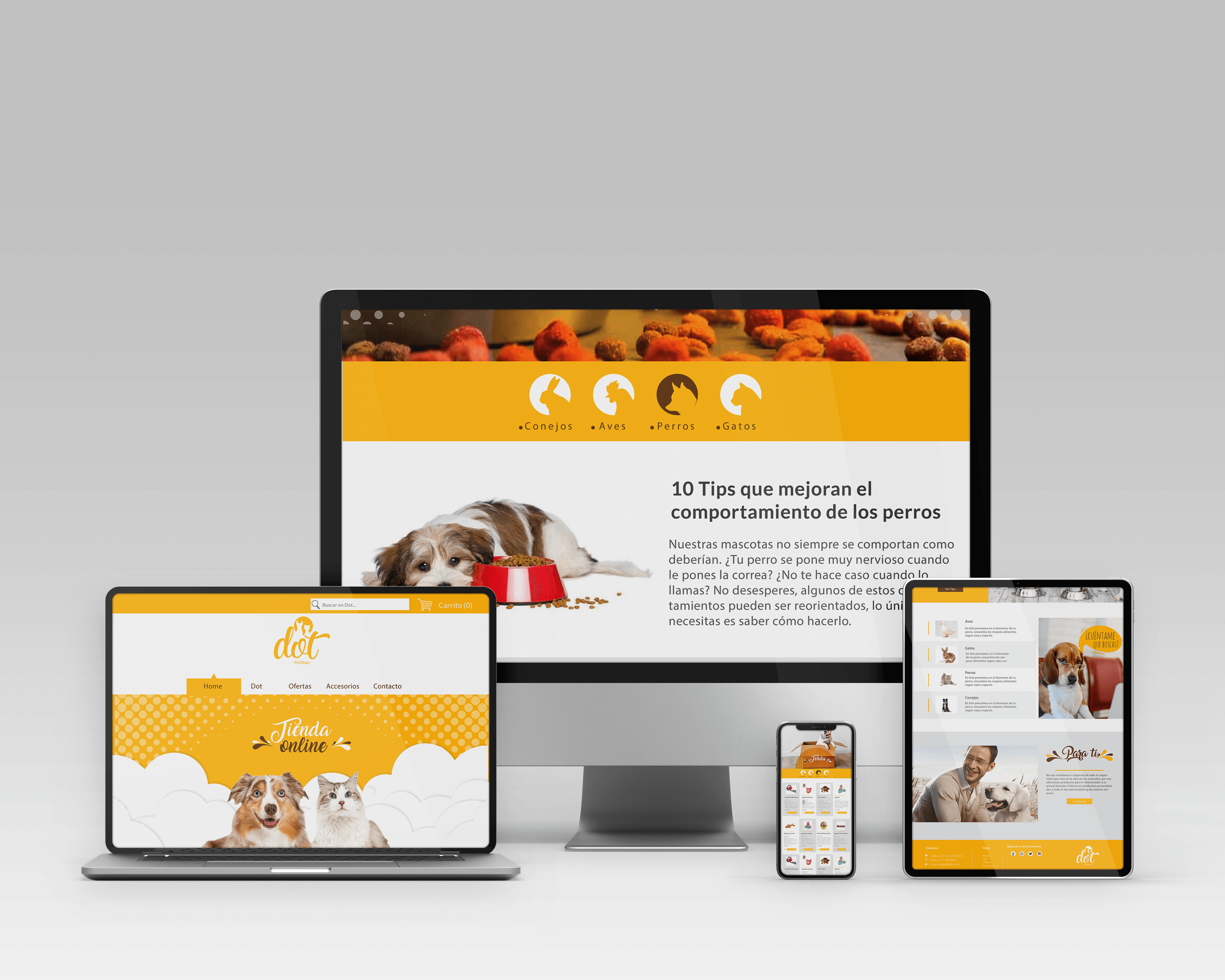
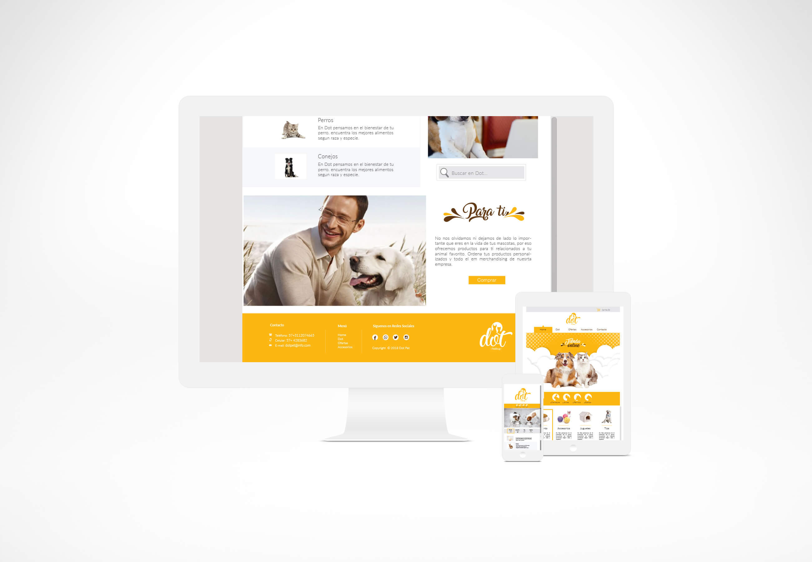
The site uses the color palette from the logo vibrant yellow and white to create a cheerful and welcoming mood for pet lovers. Playful illustrations, photos of dogs and cats, and paw-shaped elements bring life to each section. Organized sections highlight featured products, services, blog posts, and customer testimonials. Typography is clean and easy to read, ensuring accessibility across devices. The layout keeps a balance between visuals and information, guiding users to discover more about Dot’s offerings.
My Role: Complete design process: UI & UX design, branding, wireframes, prototyping, and layout creation. Developed a consistent color system, typography choices, and user flow to enhance accessibility and engagement.
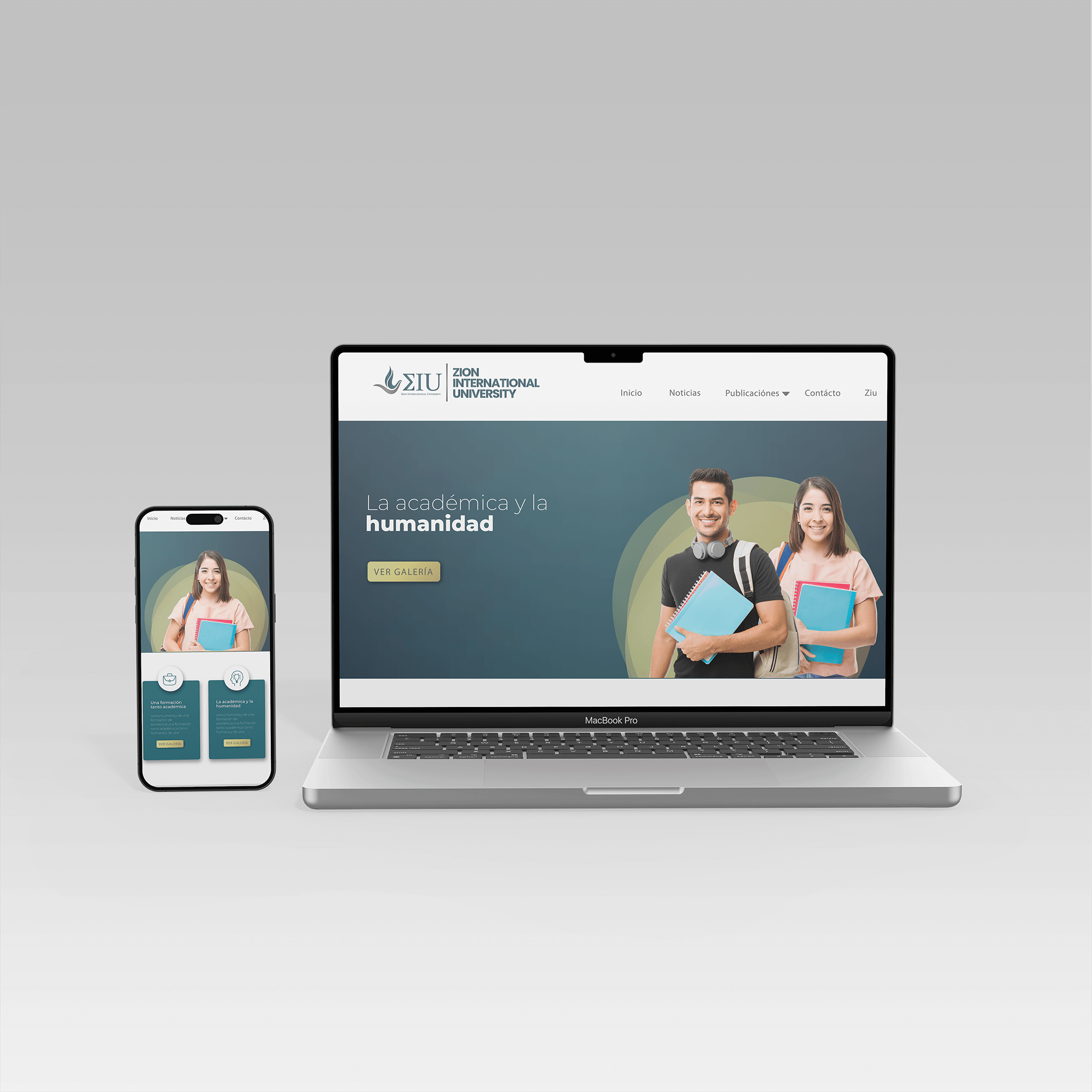
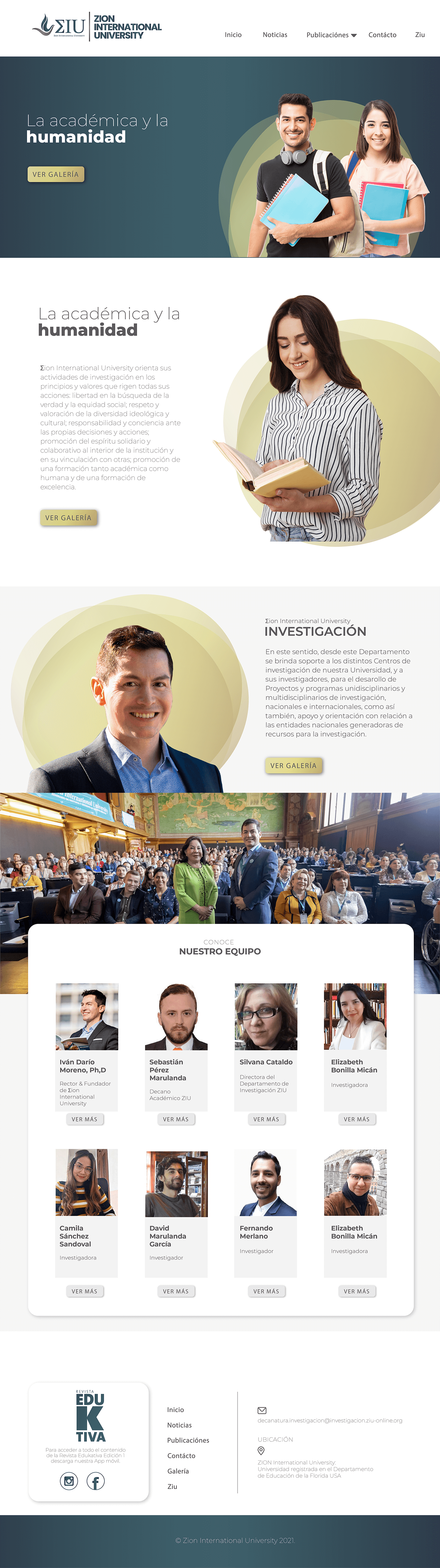
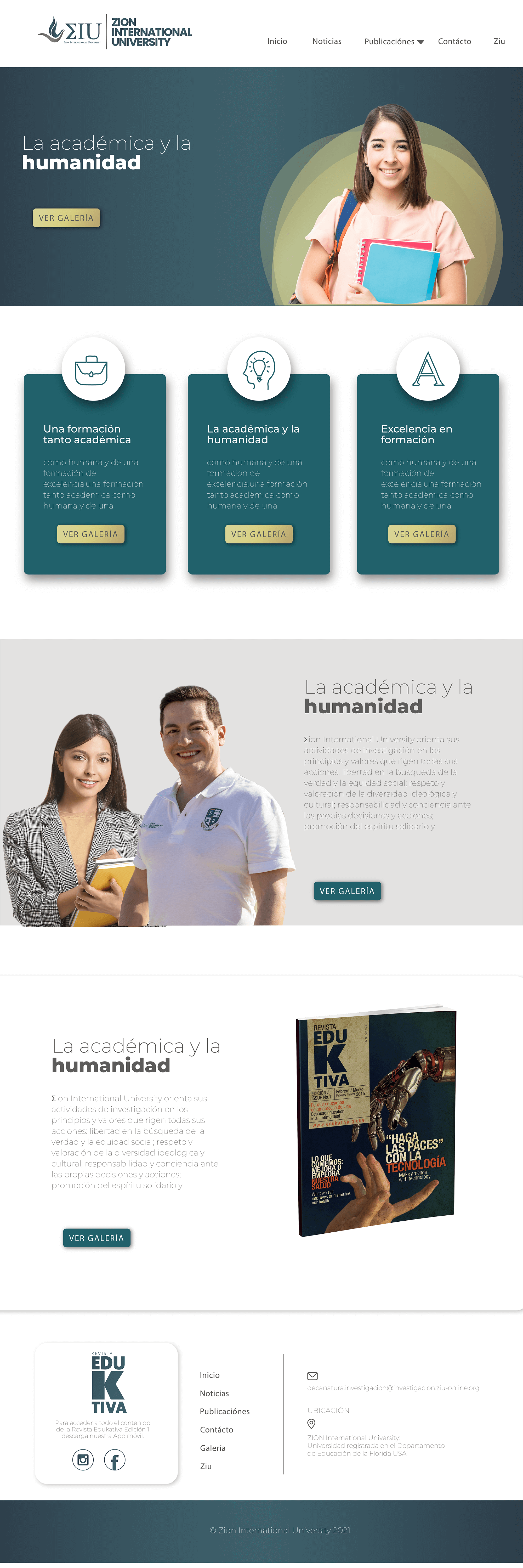
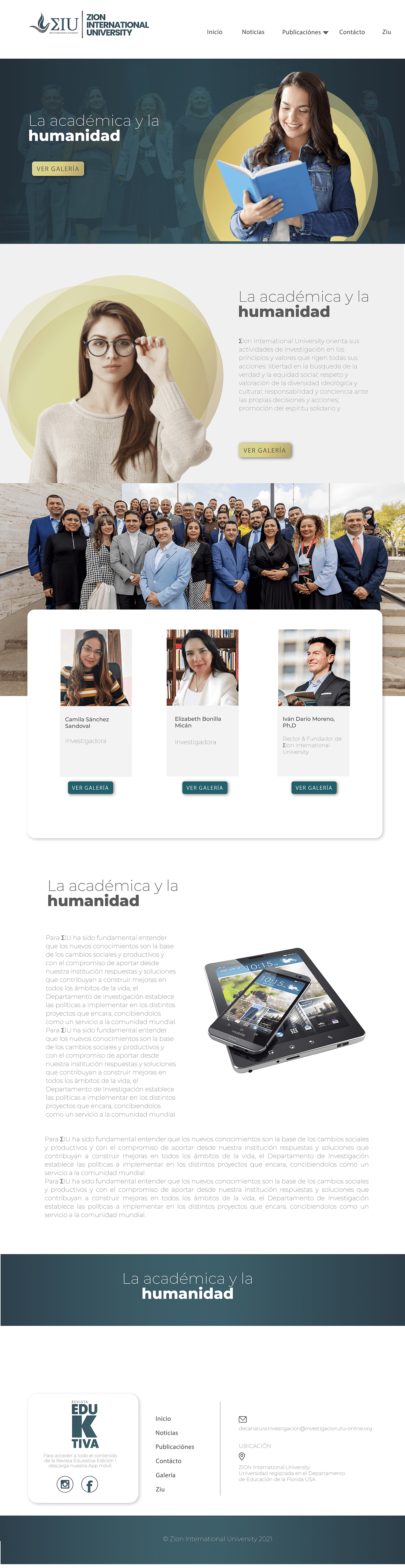
Zion International University (ZIU) is an online, faith-based institution with a website designed to reflect professionalism, warmth, and spiritual grounding. The layout uses a calming color palette of deep green, cream, and gold, while circular elements symbolize tradition, growth, and faith.
Clear navigation and modern typography ensure accessibility, while authentic photography highlights key areas such as programs, admissions, and student life. The design communicates credibility and community, making the site welcoming and easy to explore.
My Role: I was responsible for the entire design and development process, including UI/UX design, layout creation, branding adaptation, and prototyping.
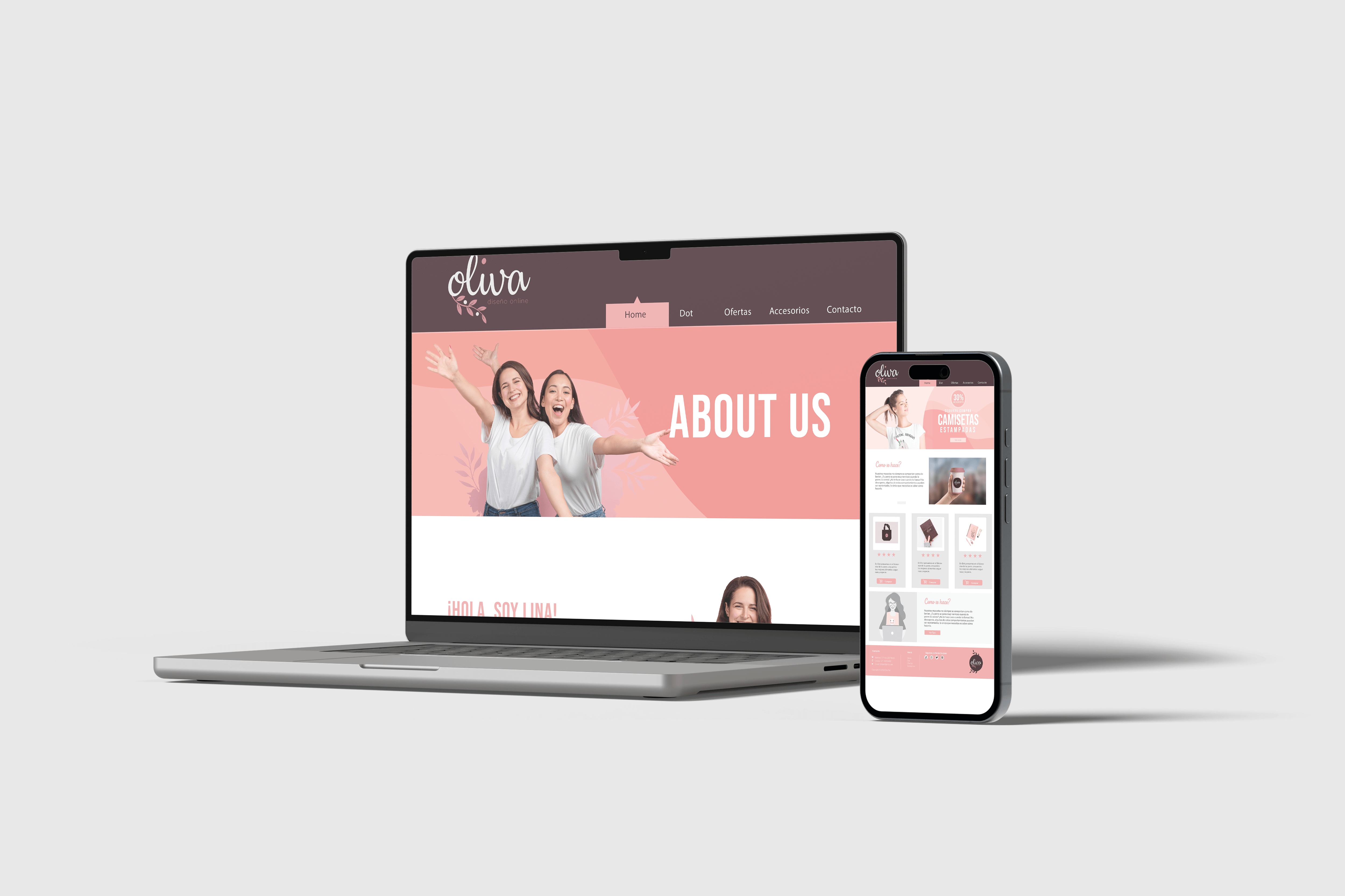
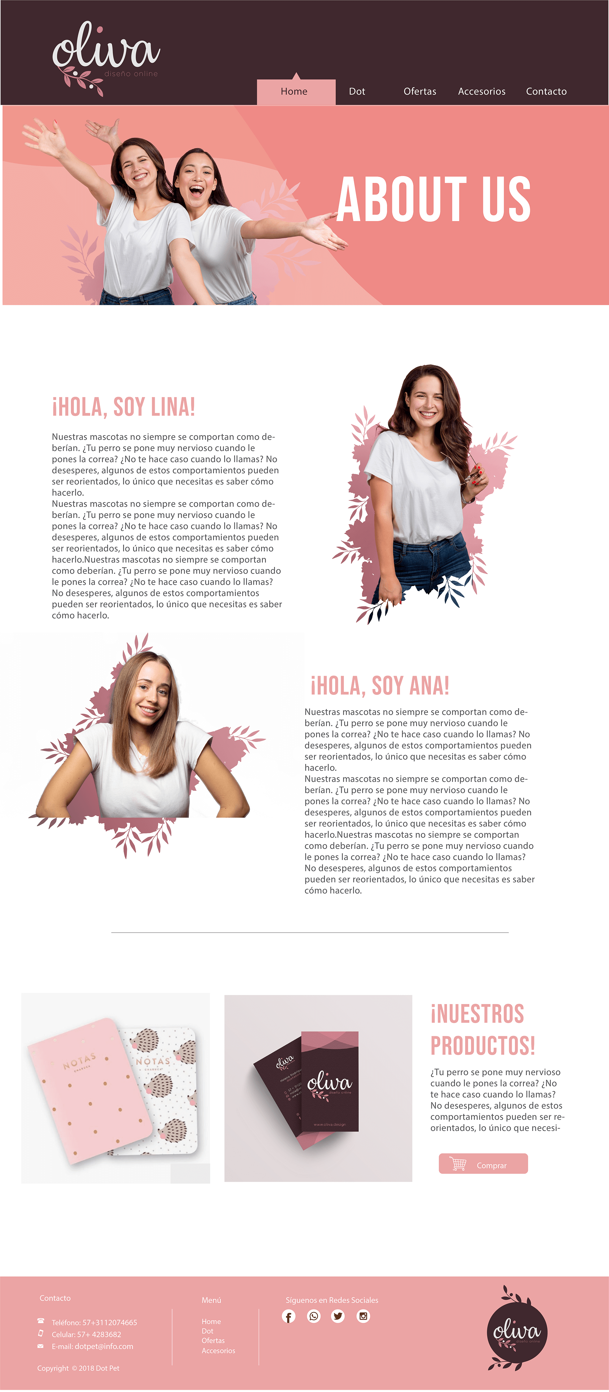
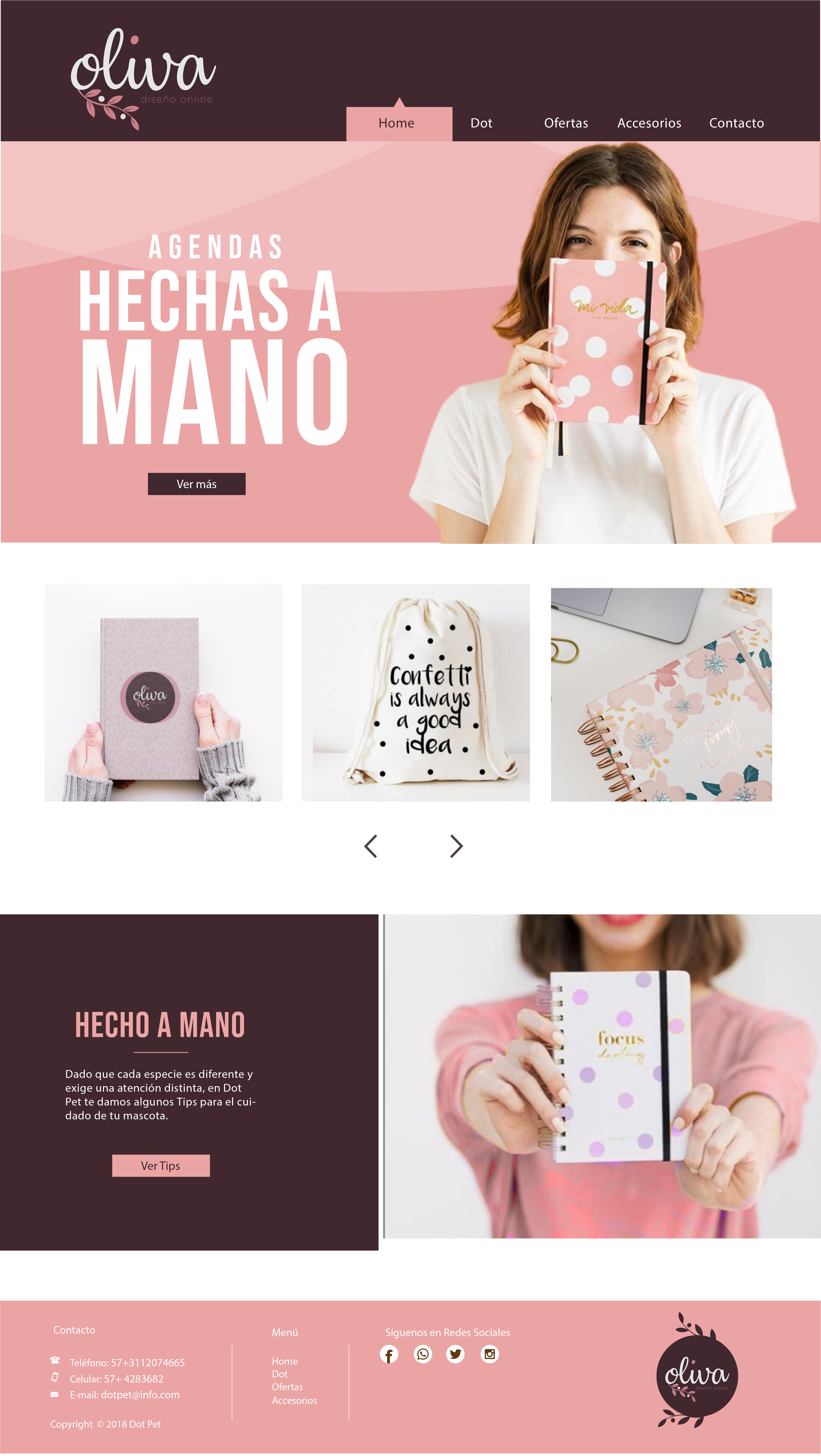
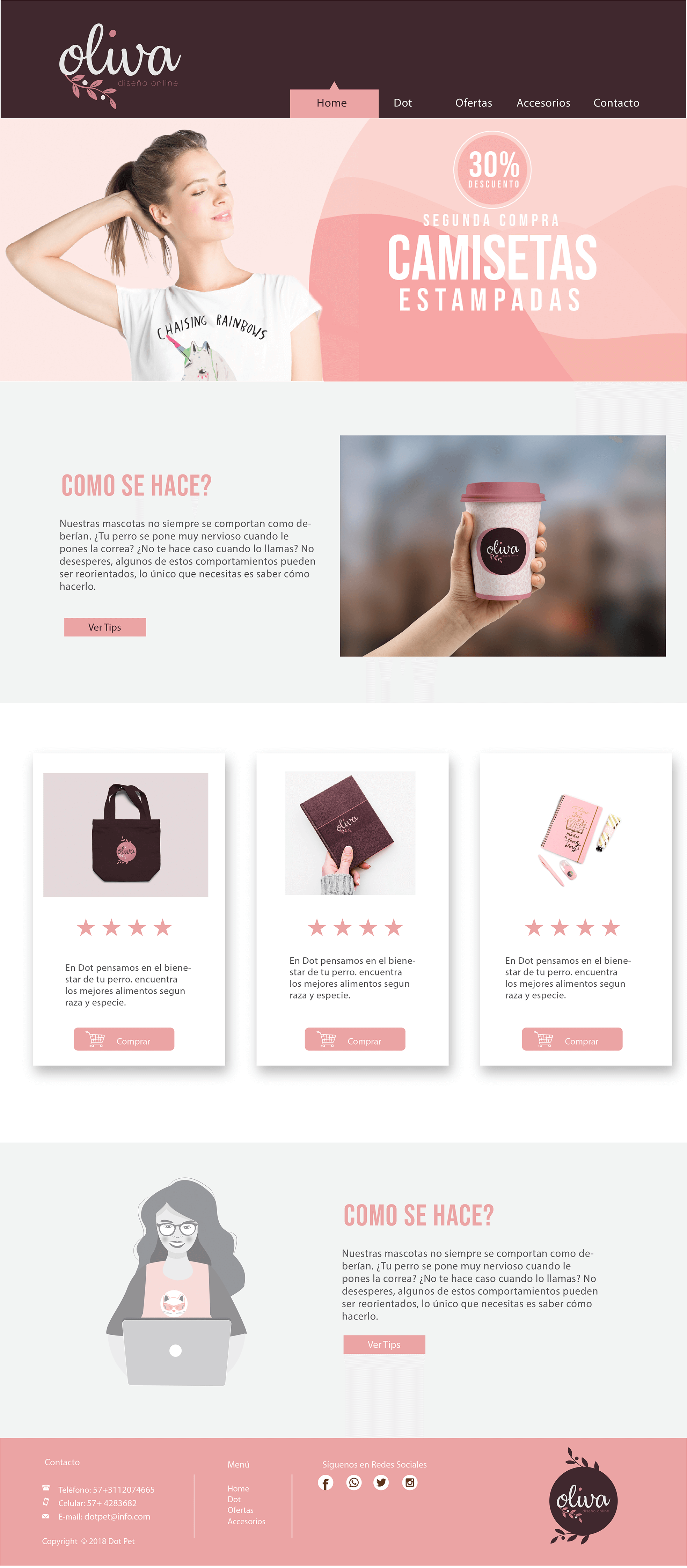
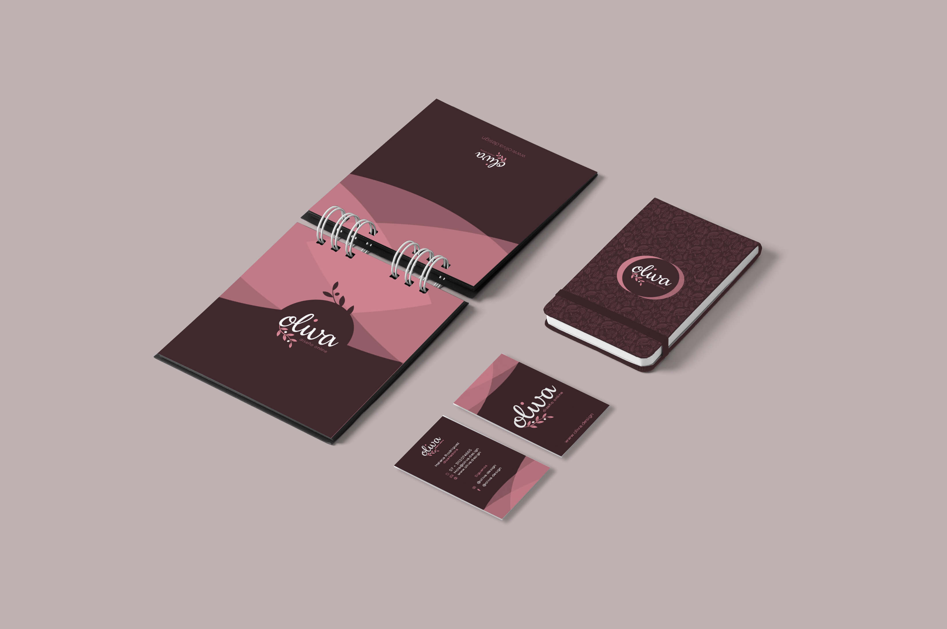
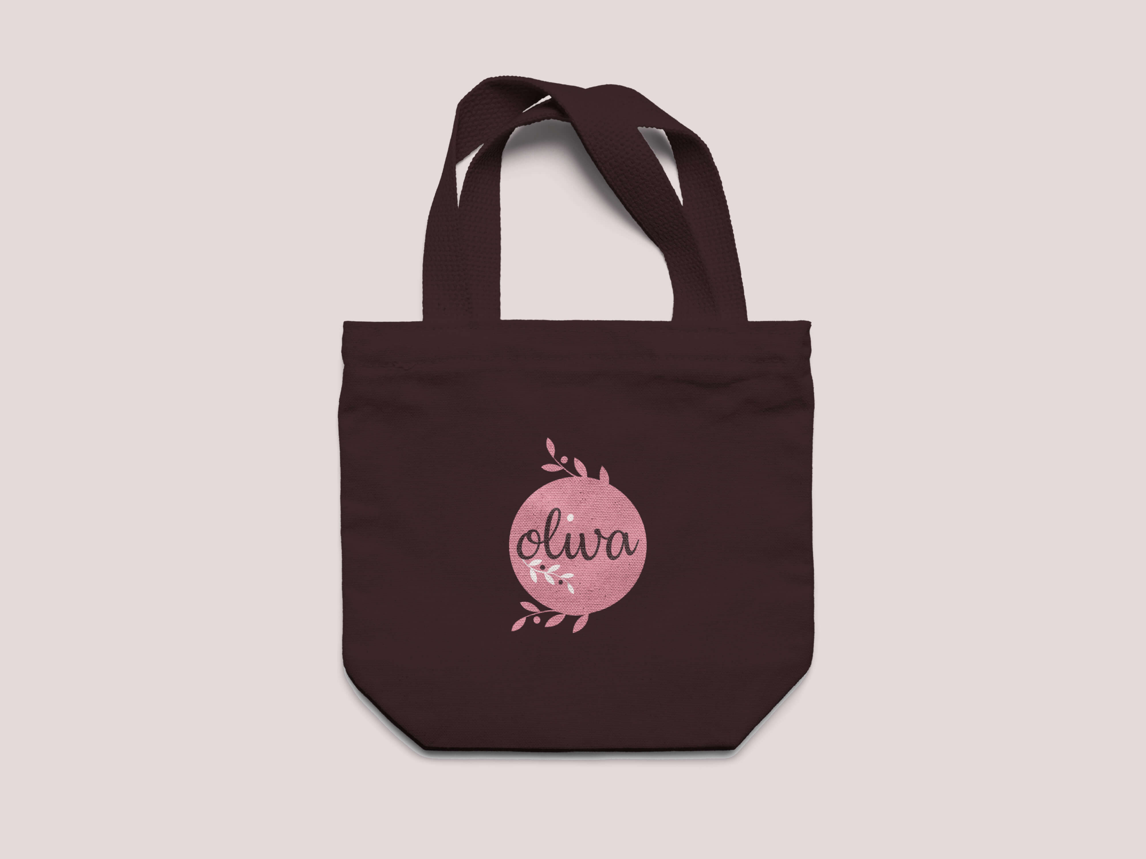
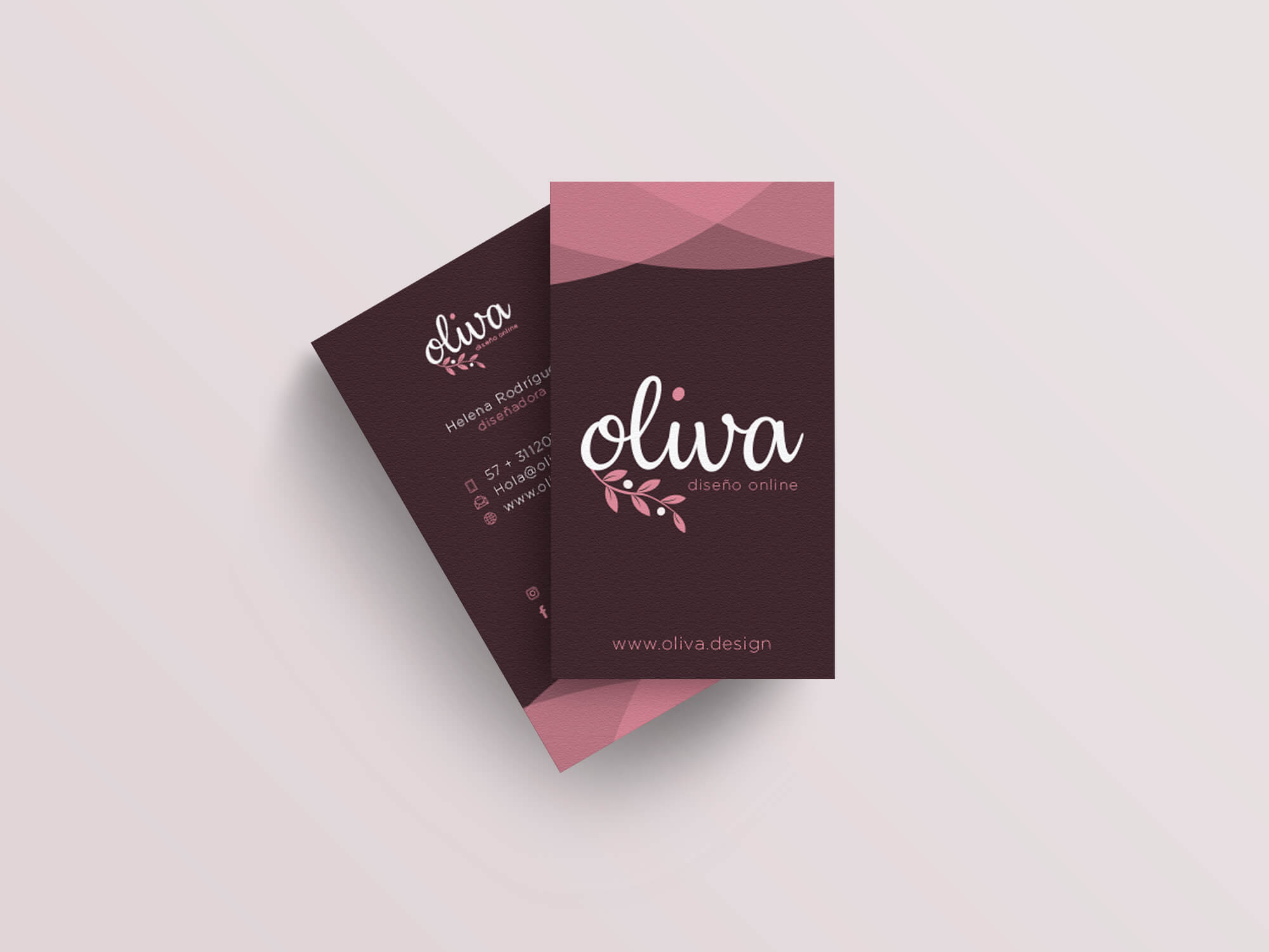
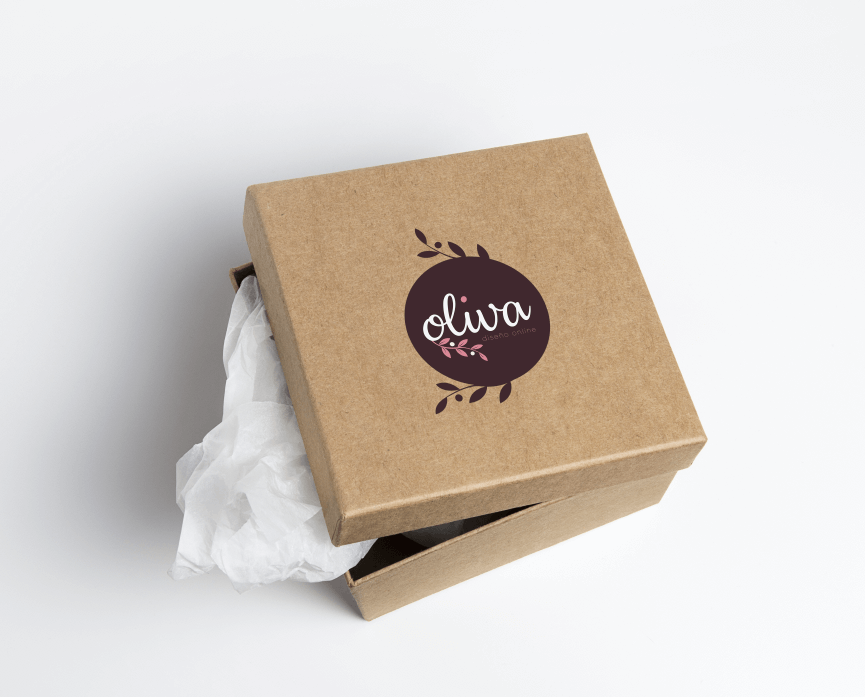
Oliva is a web project designed for a small business that offers handmade products such as notebooks, cushions, and backpacks. The design concept conveys a warm, artistic, and approachable visual identity that aligns with the brand’s essence.
The website highlights the handcrafted nature of the products through a soft color palette of pink, terracotta, and neutral tones. Its clean structure guides users smoothly through sections like About Us, featured products, and the shopping area, ensuring a friendly and well-organized navigation experience.
My Role: Full project development, including UI/UX design, branding, wireframes, prototyping, and front-end layout.
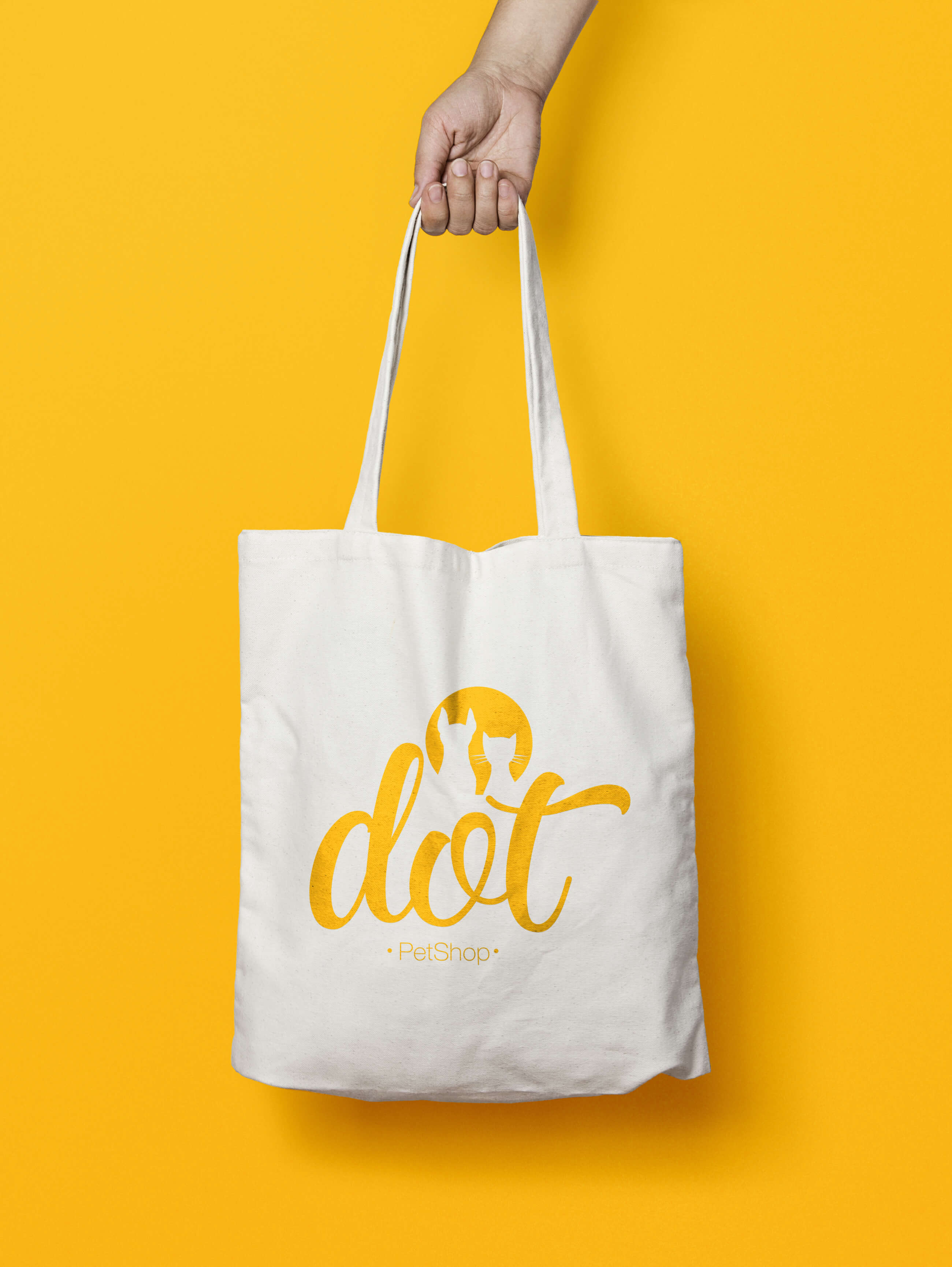
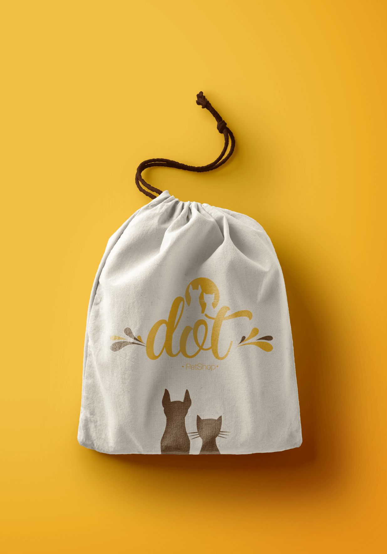
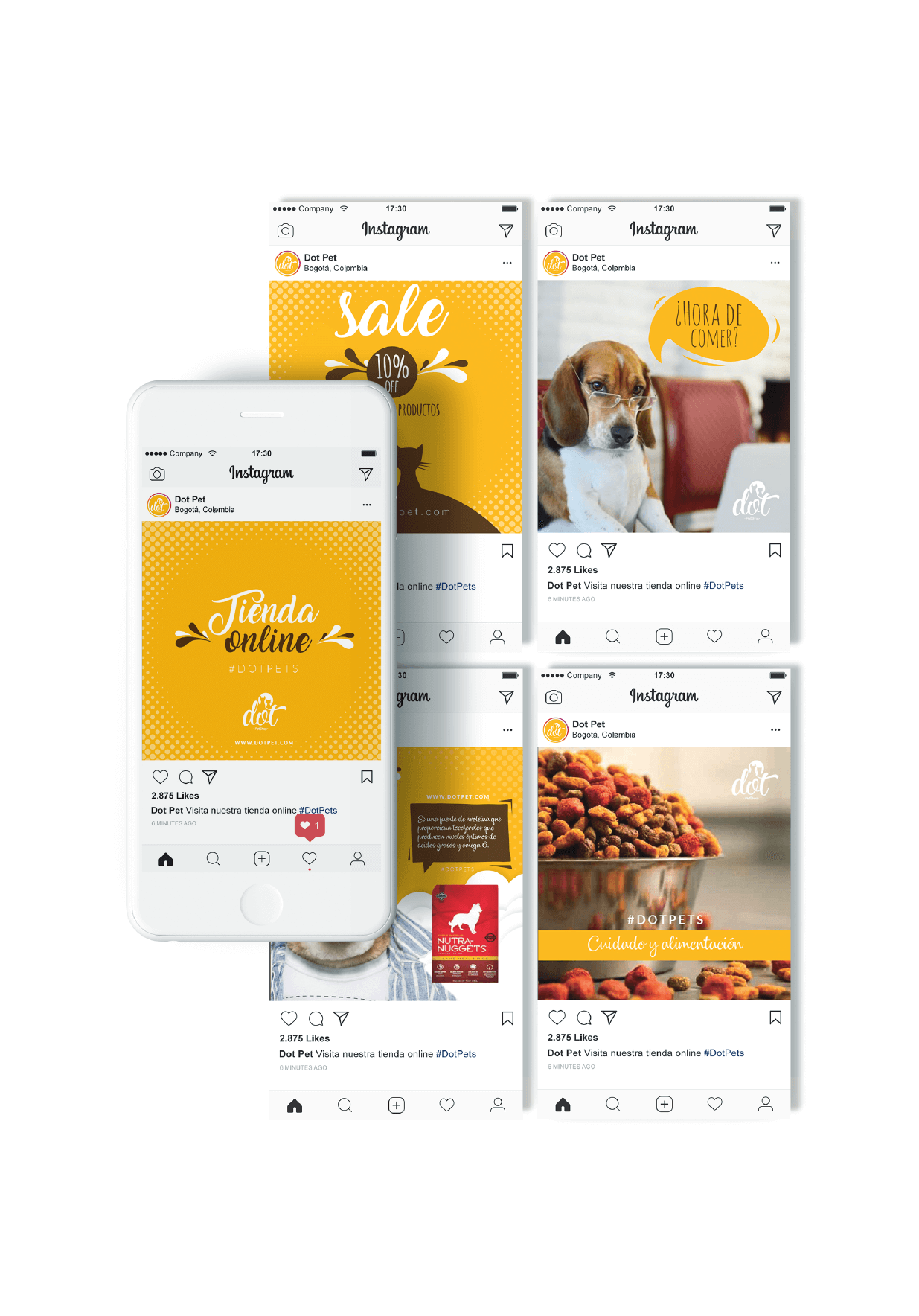
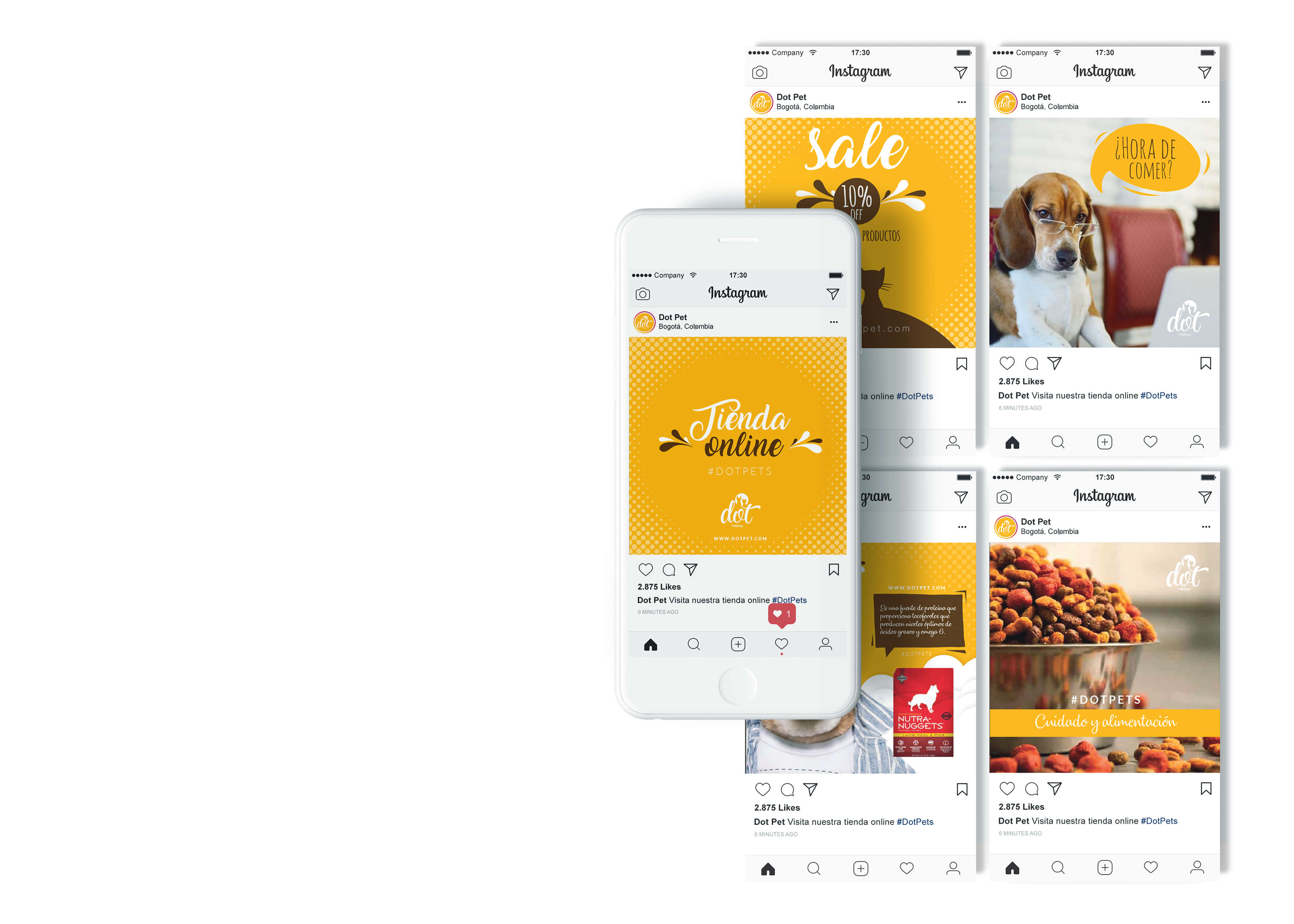
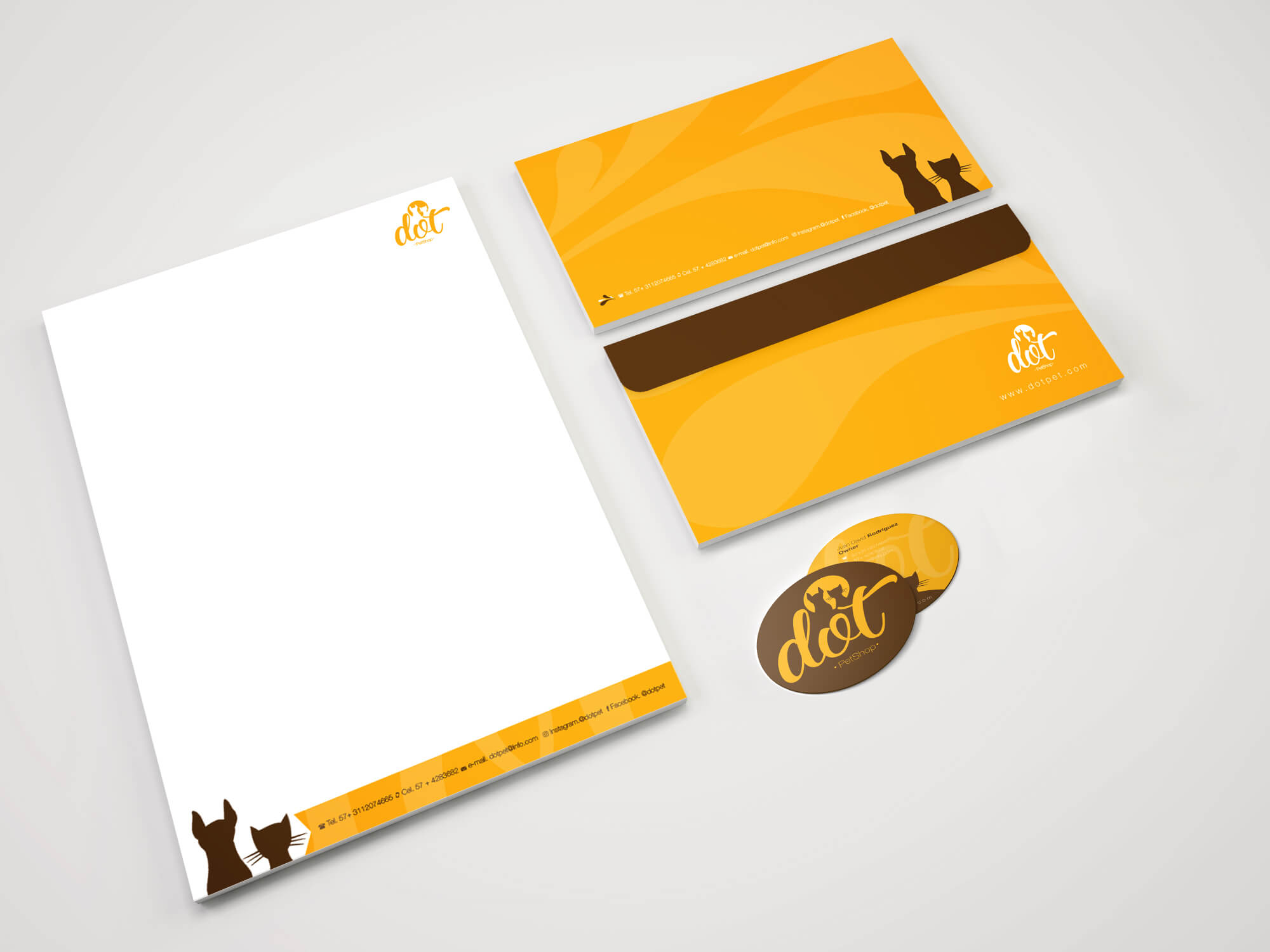
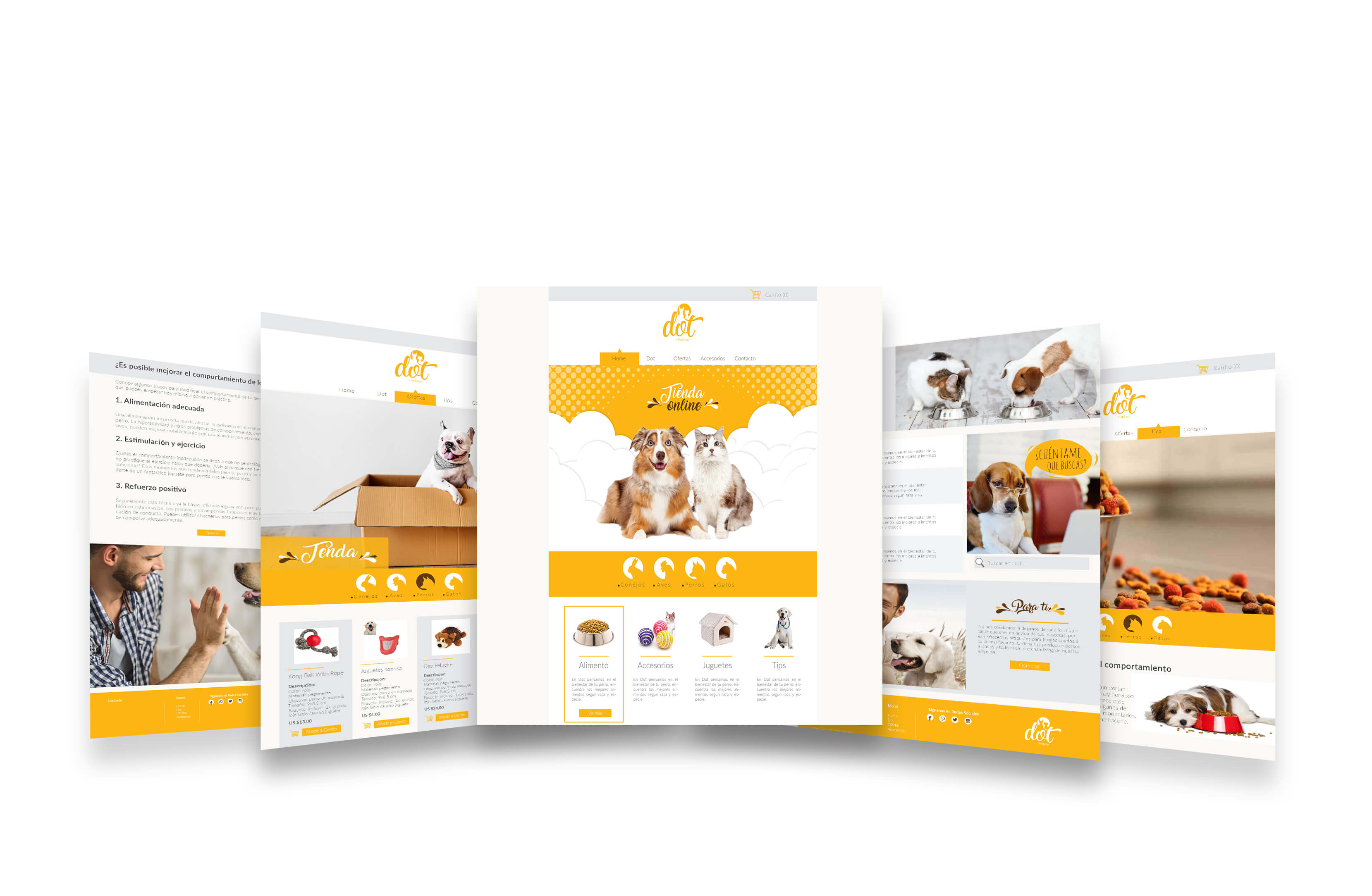
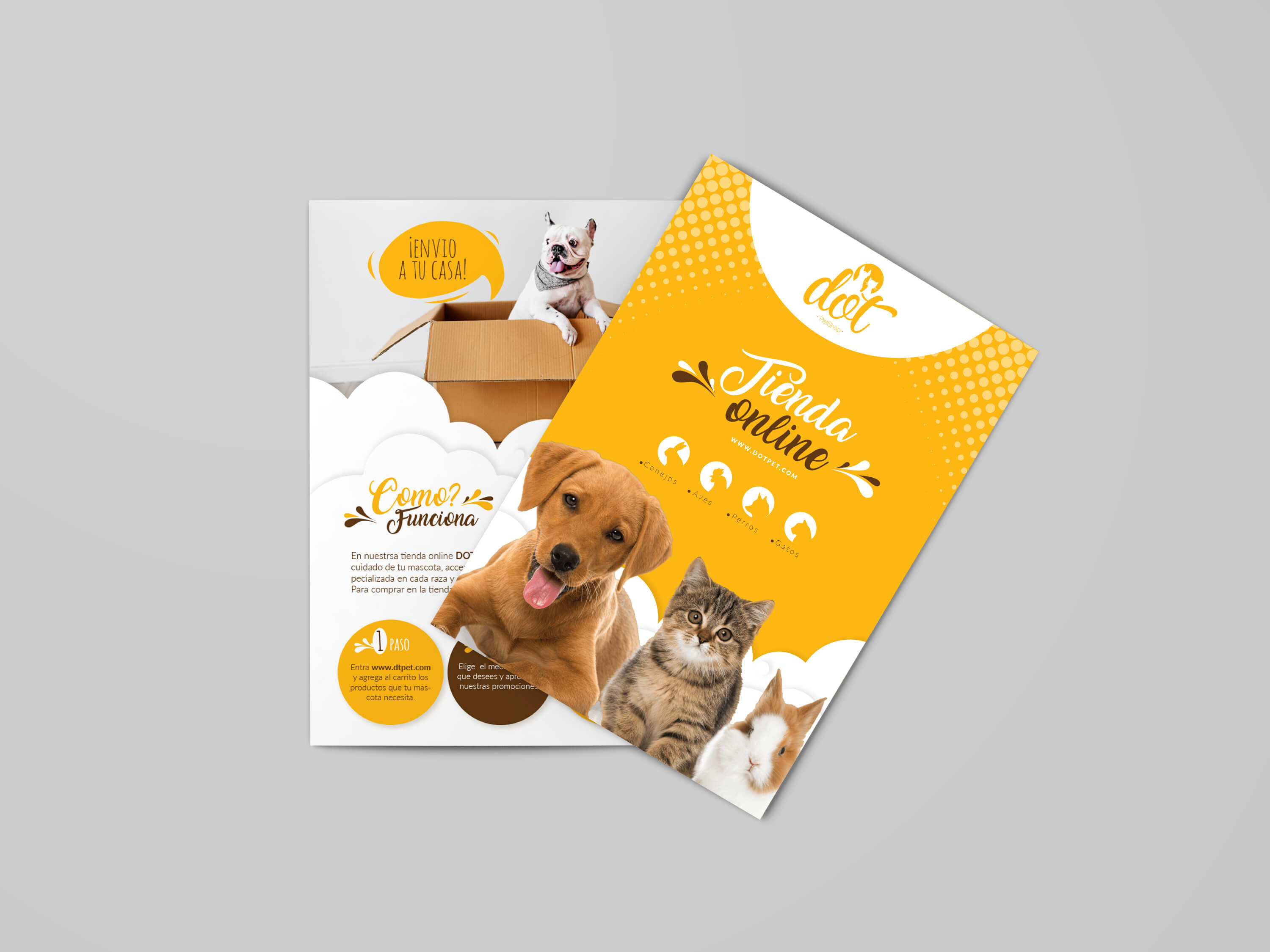
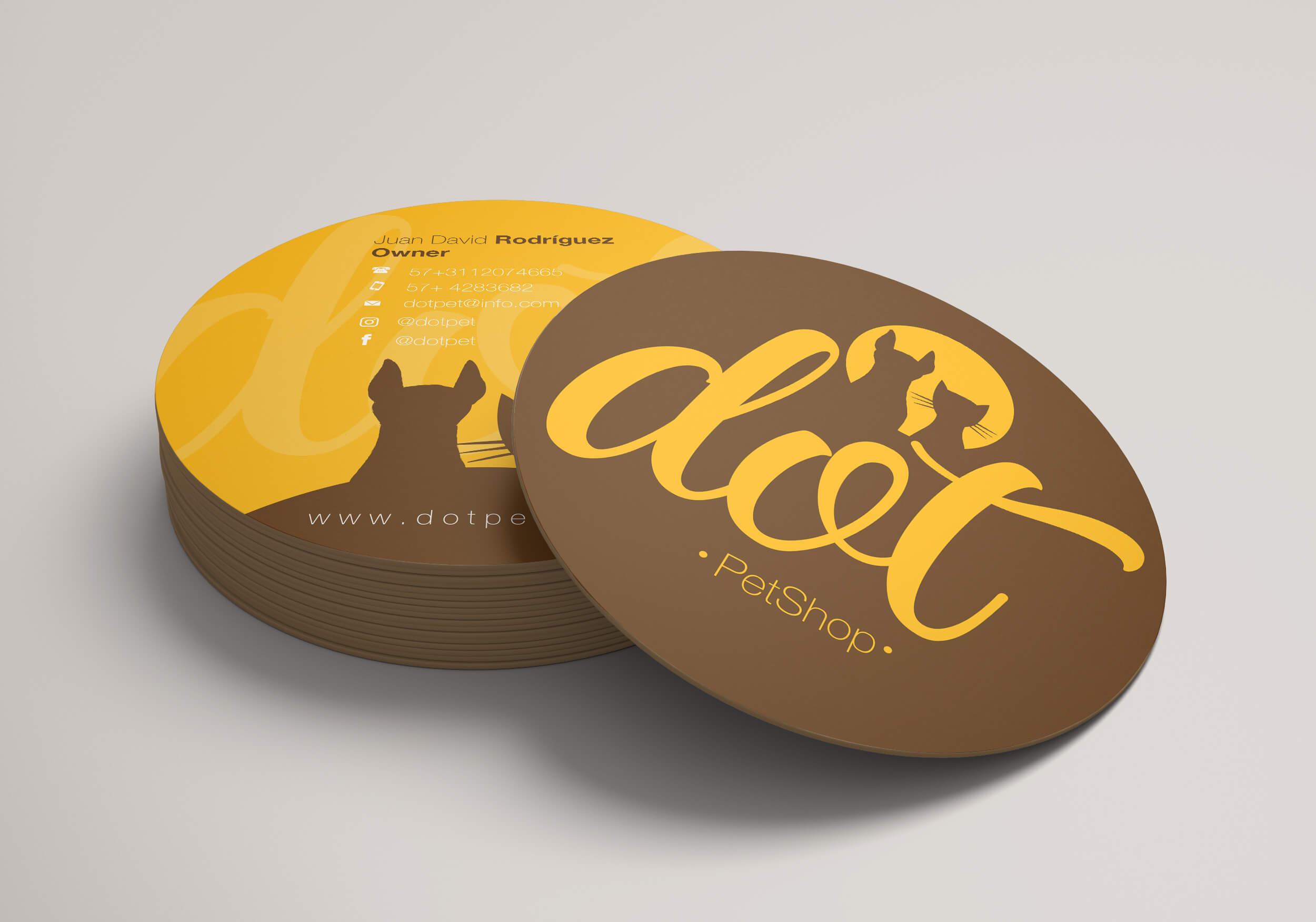
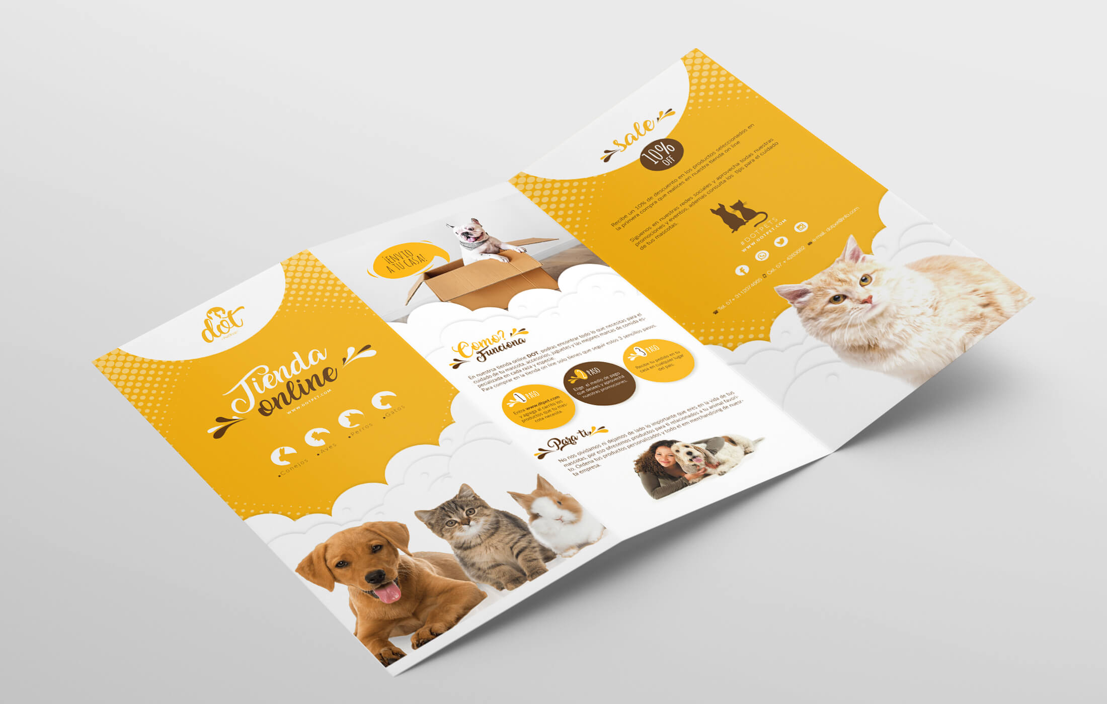
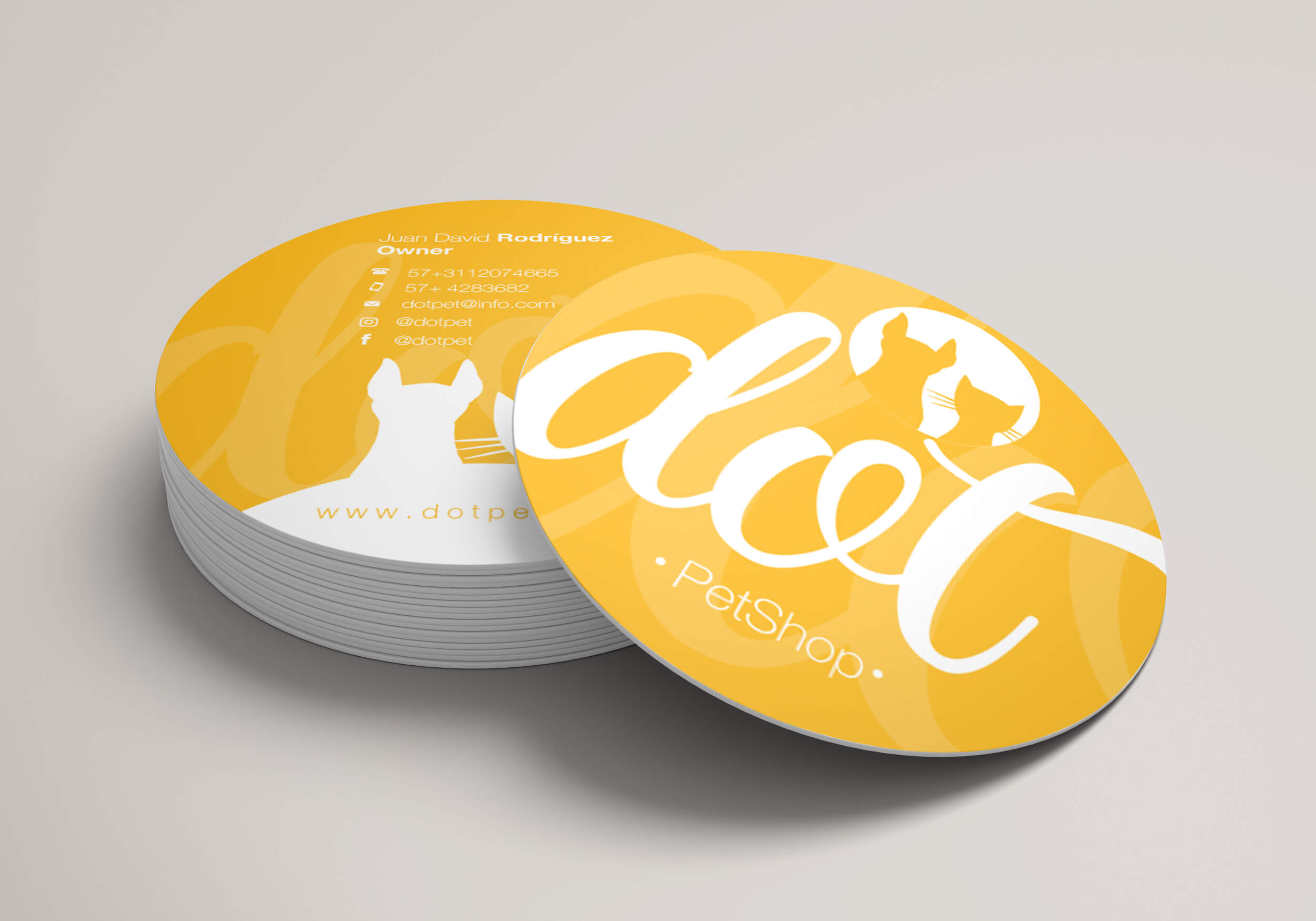
Dot is a store specializing in products and food for dogs, cats, rabbits, and birds. More than just a business, Dot seeks to build a conscious and caring community by promoting animal well-being through high-quality products and educational content.
The project focused on developing a friendly, modern, and consistent visual identity that reflects the warmth and reliability of the brand. The branding included the creation of a logo system, packaging, stationery, social media templates, and promotional materials, all designed with a cohesive color palette and playful graphic elements to communicate trust and approachability.
This project demonstrates how design can help position a brand as both professional and approachable, while fostering meaningful connections with its audience.
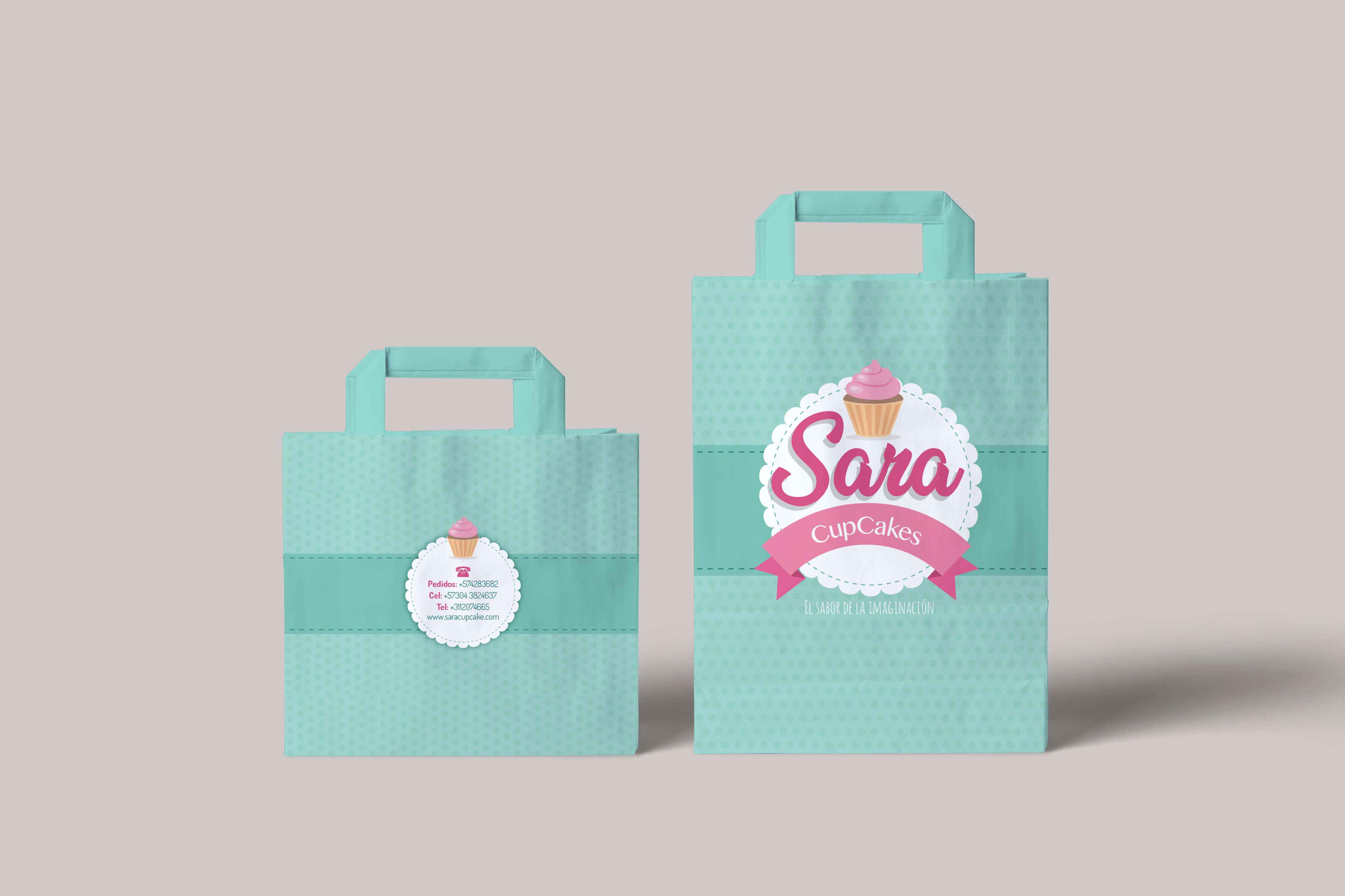
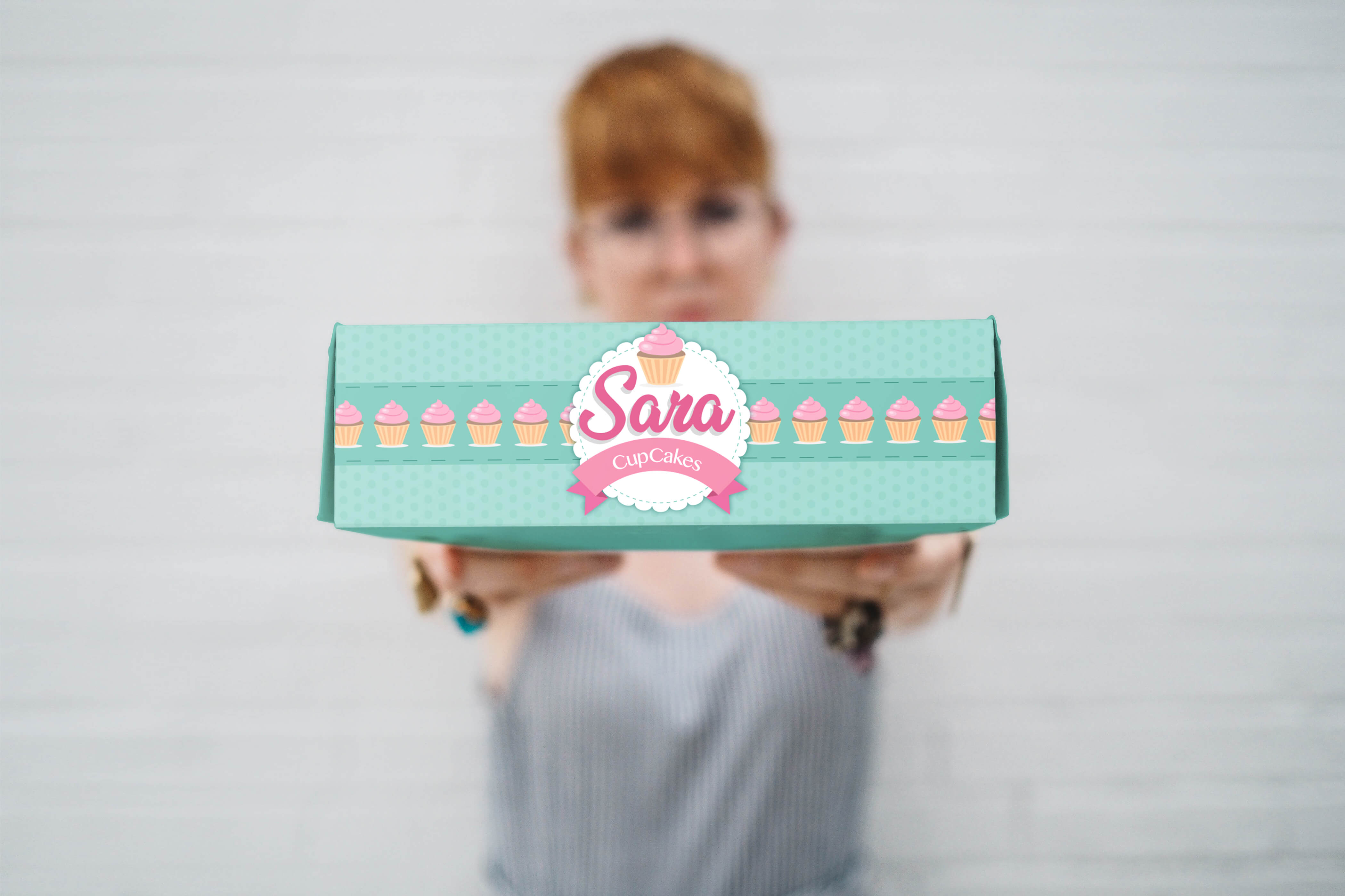
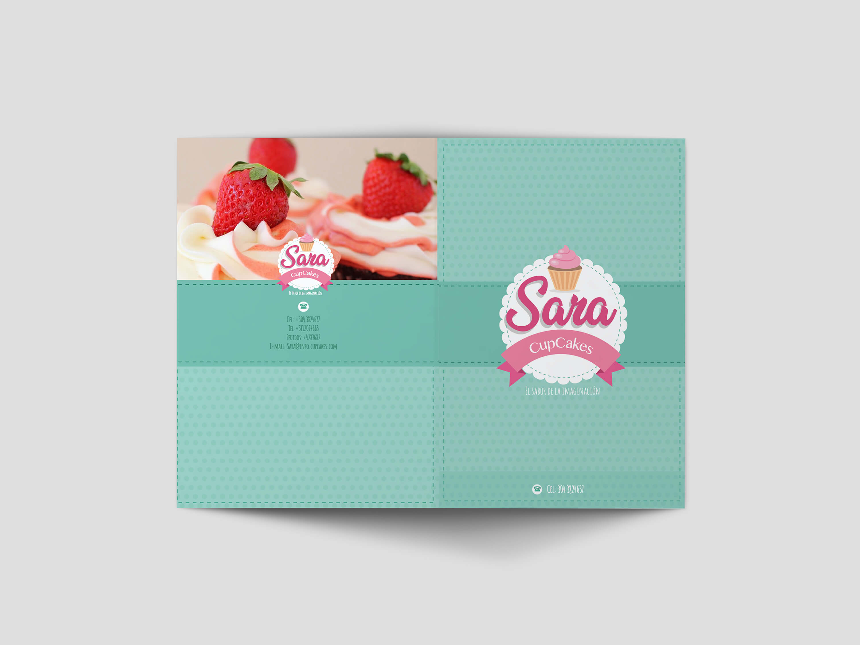
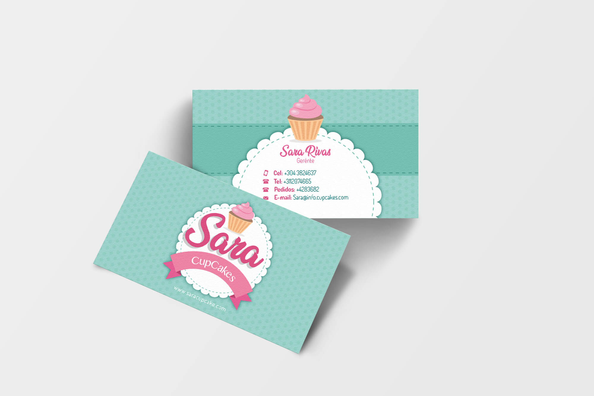
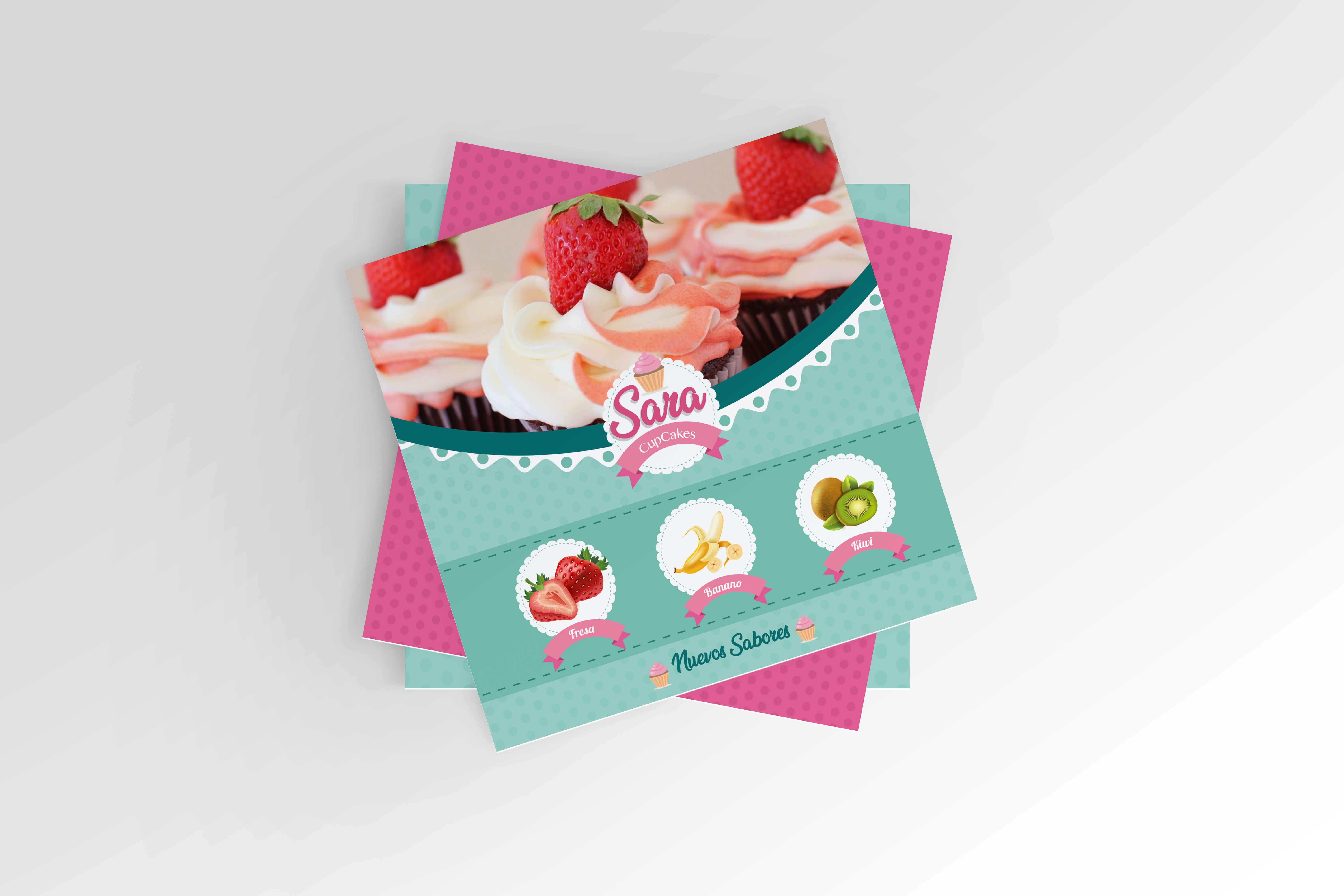
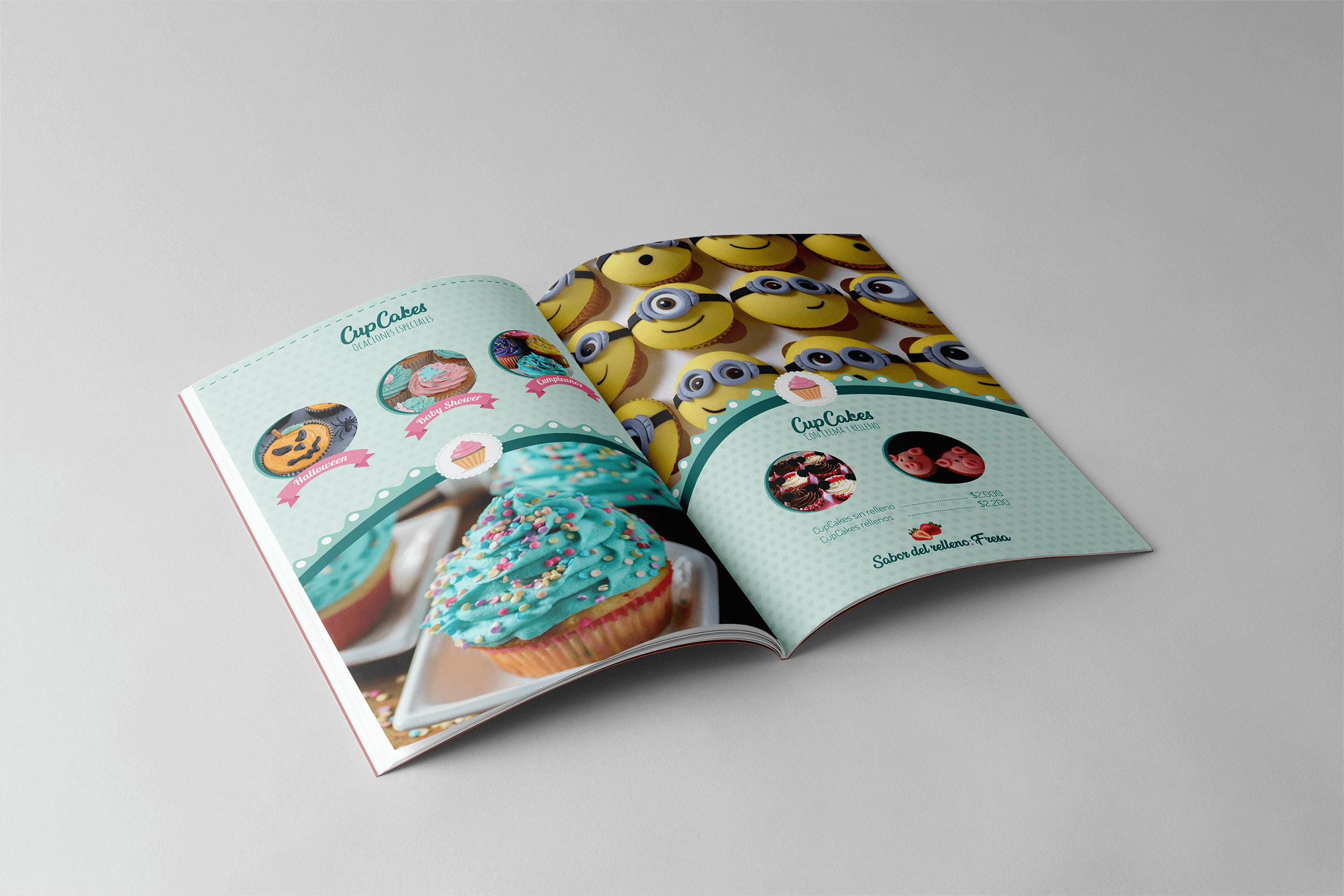
Sara Cupcakes is a bakery brand focused on creating delightful and colorful treats that bring joy to every occasion. The project aimed to build a brand identity that feels playful, sweet, and inviting, while maintaining a professional and consistent look across packaging, social media, and printed materials.
This project highlights how design elements such as color palettes, typography, and illustration can work together to create an emotional connection with customers.
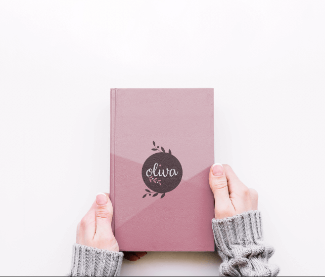
The Oliva logo shows the brand’s handmade and gentle style. It uses a soft, rounded font that feels warm and friendly. The letters look natural and calm, matching the creative and peaceful spirit of the brand.
Sometimes, the logo includes a small detail— like a leaf or hand-drawn line—that reminds us of nature and handmade work. Its simple design makes it easy to use on packaging, tags, social media, or printed items.
The colors of the logo go well with Oliva’s soft palette (pink, salmon, terracotta), creating a beautiful and consistent brand look
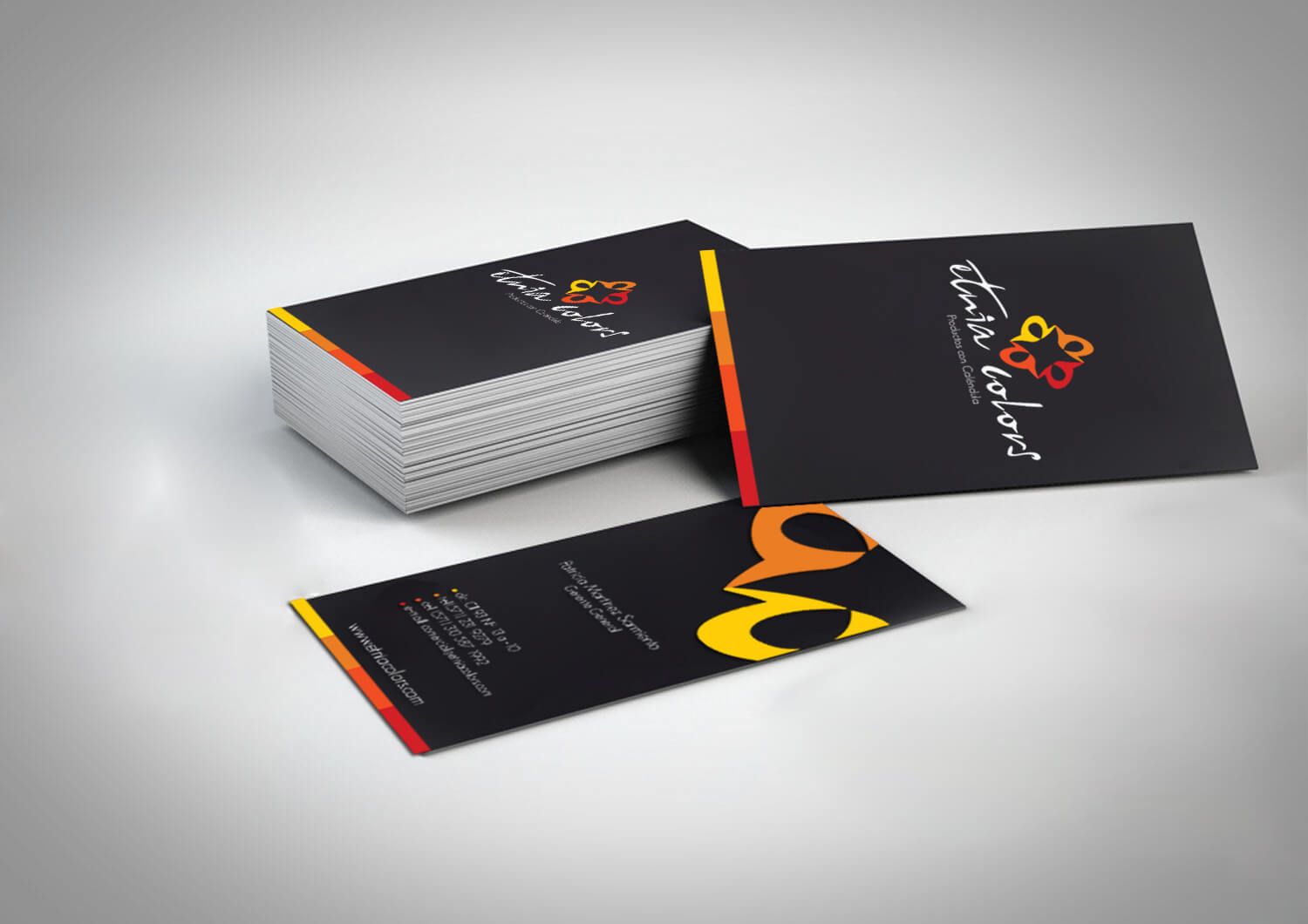
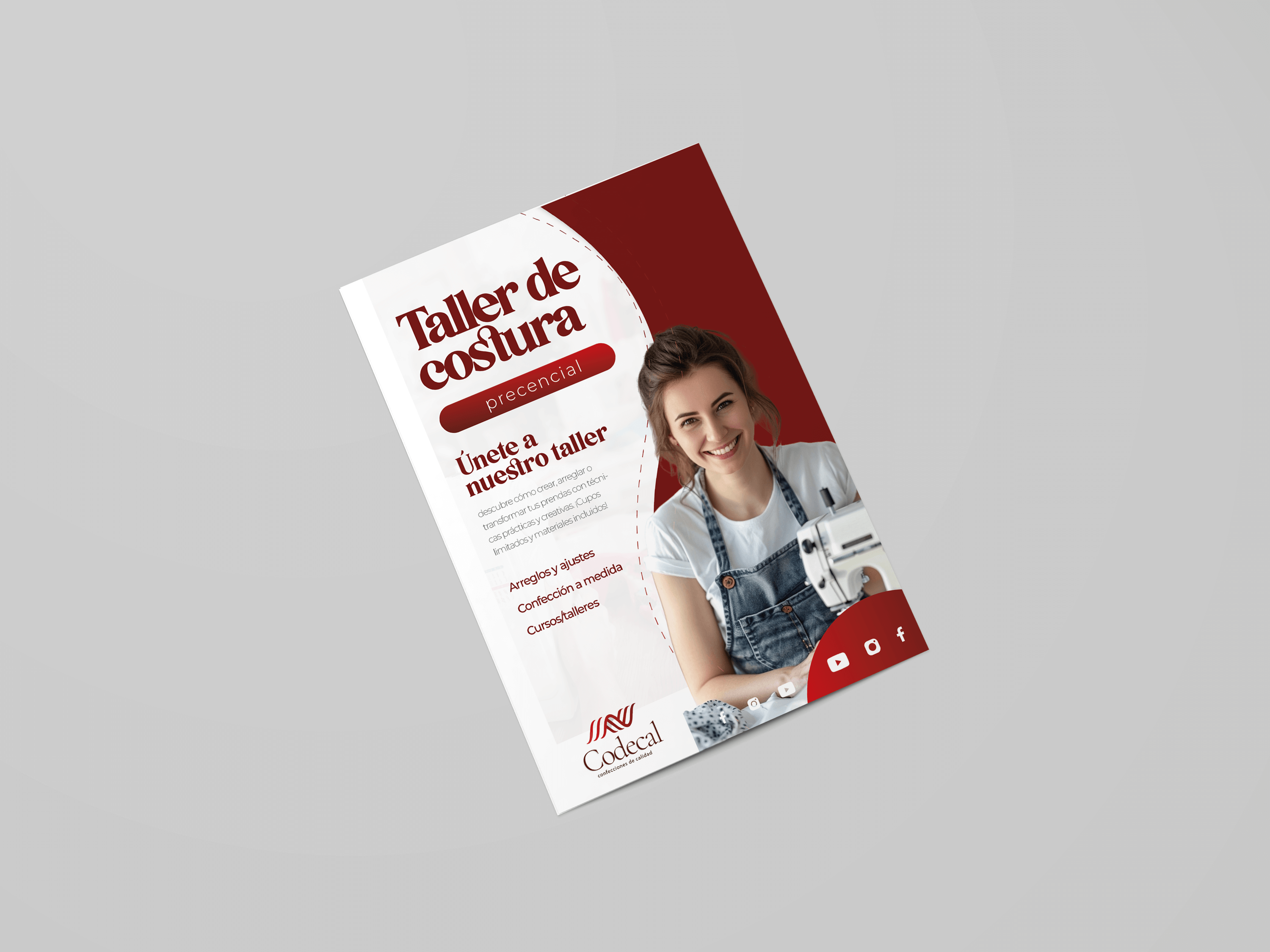
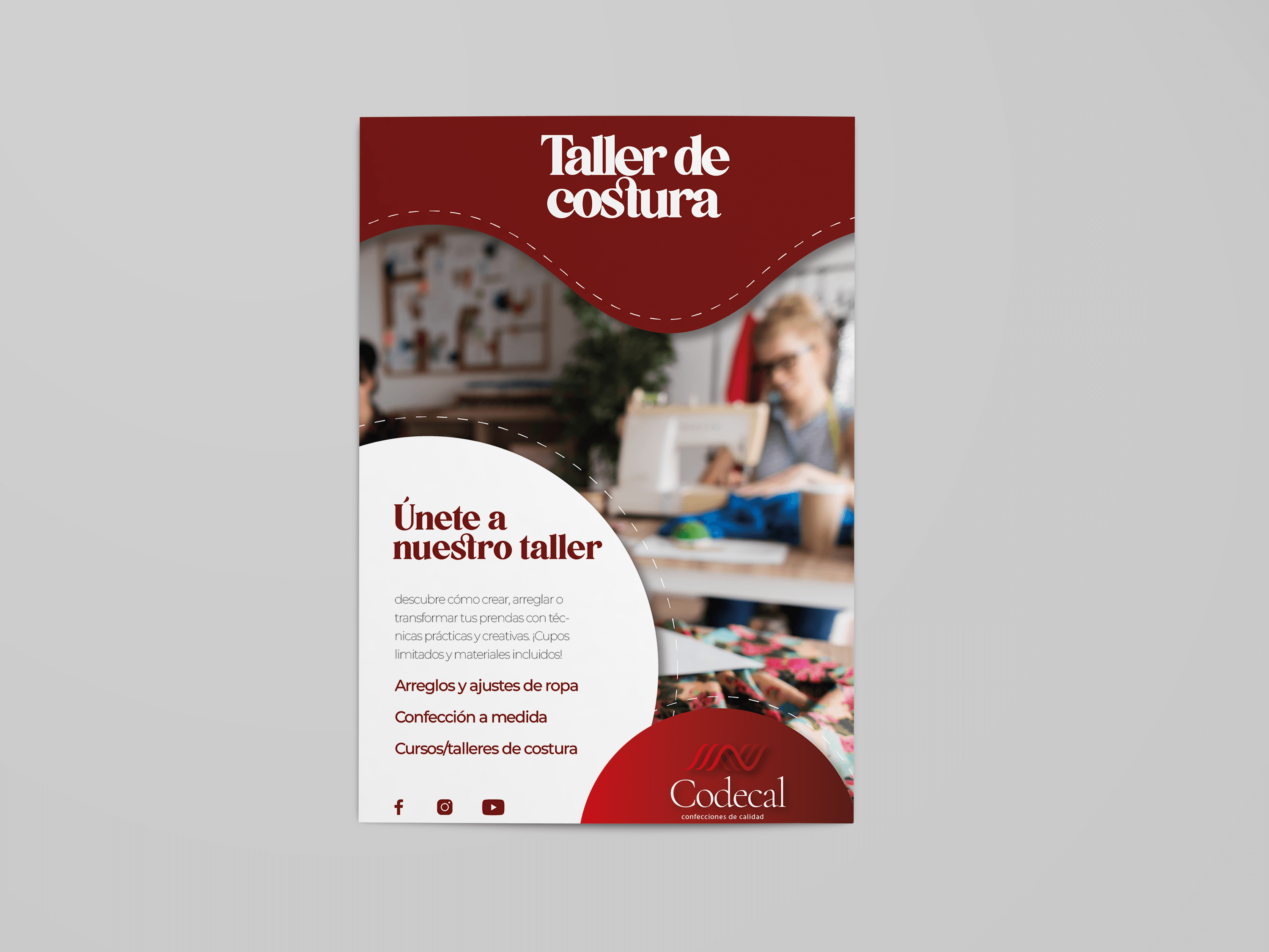
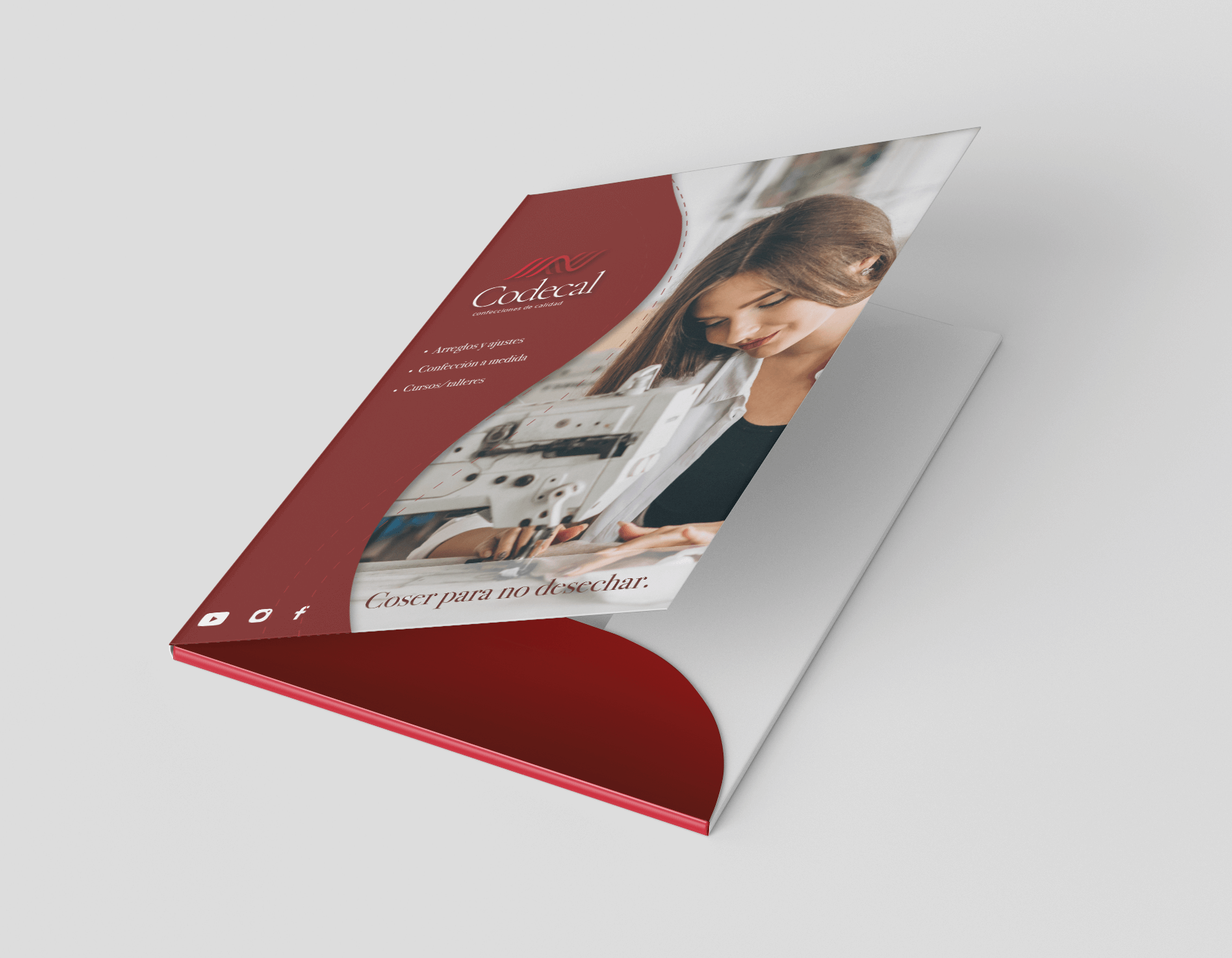
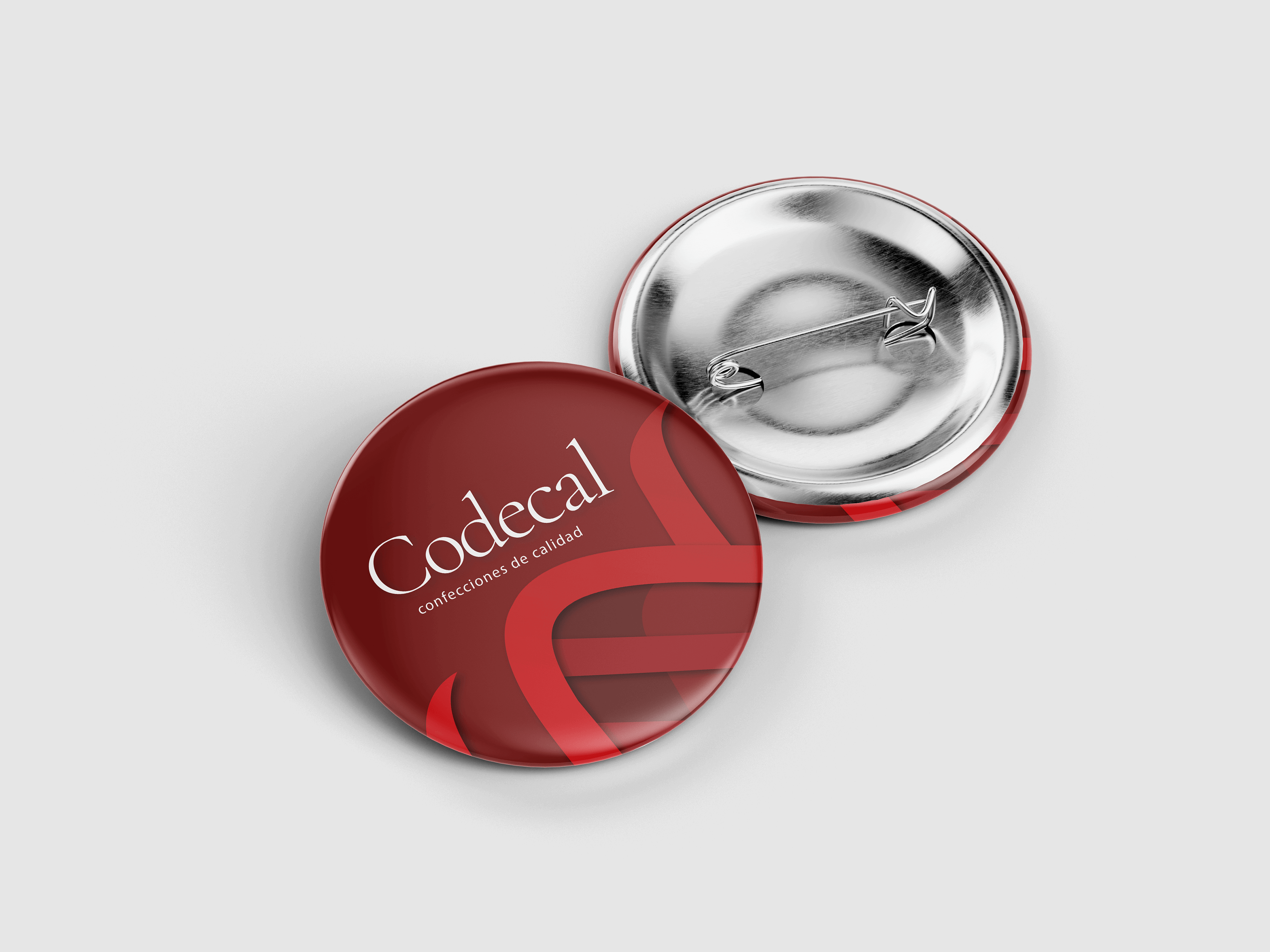
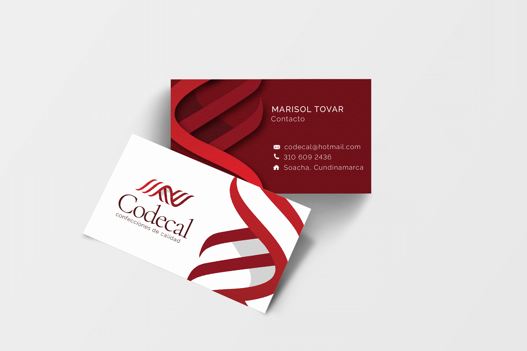
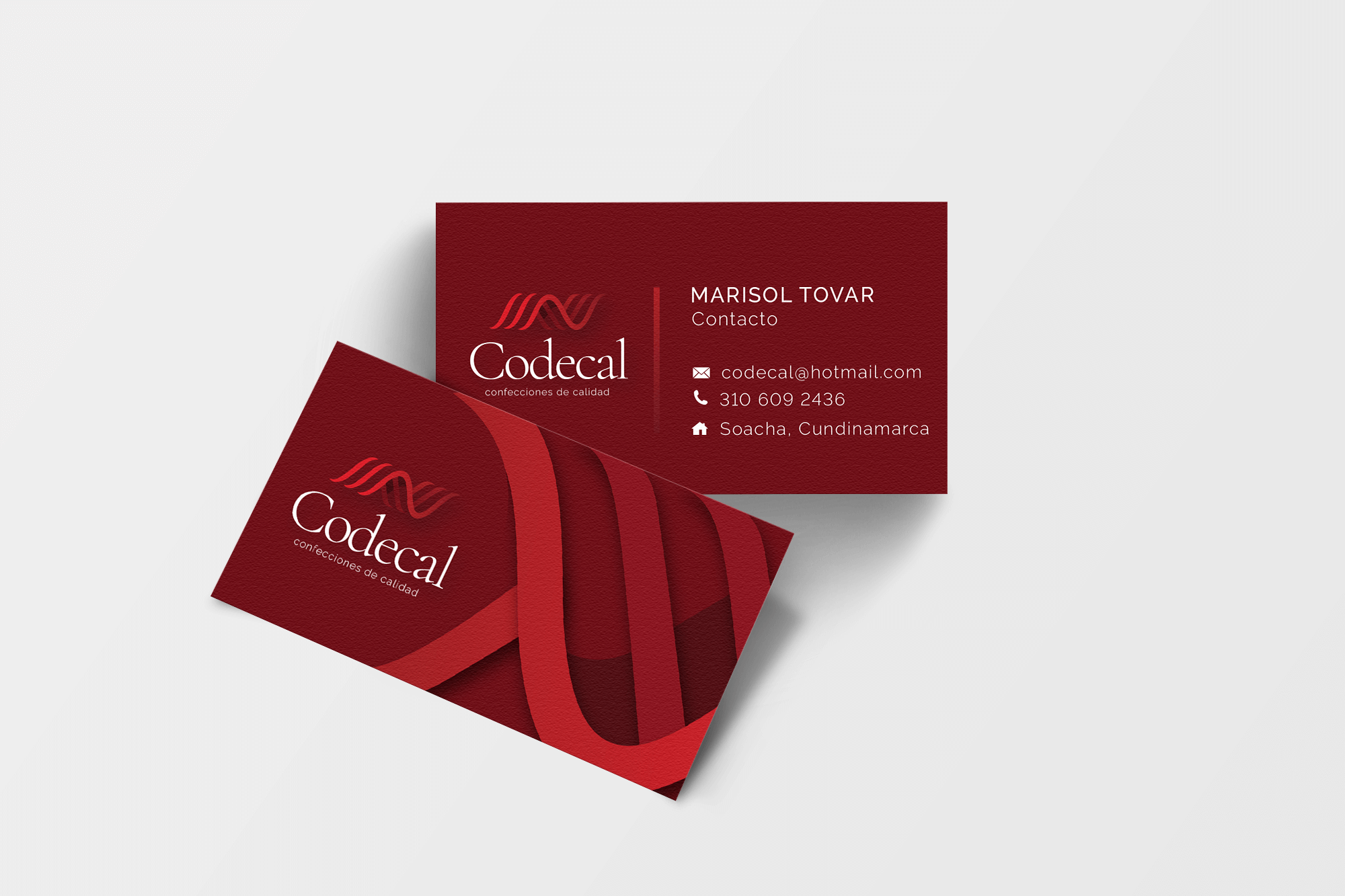
Codecal is a small business specializing in clothing repairs and custom designs. The branding blends a handmade, traditional feel with a modern and professional look. A color palette of deep reds, browns, and grays conveys warmth and reliability. The thread-inspired logo highlights the sewing theme, while the simple, elegant typography adds a sense of trust and quality.
All promotional materials, flyers, business cards, brochures, and buttons, follow the same style, creating a consistent and recognizable identity that reflects the care and attention put into every garment.
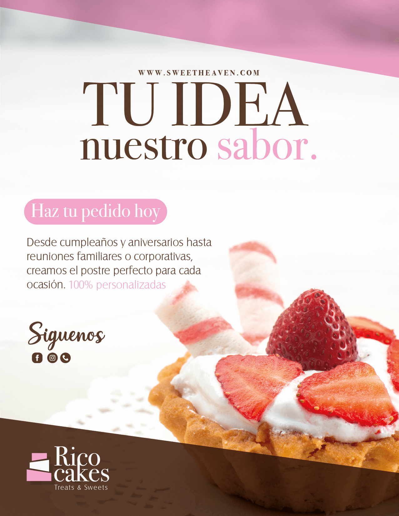
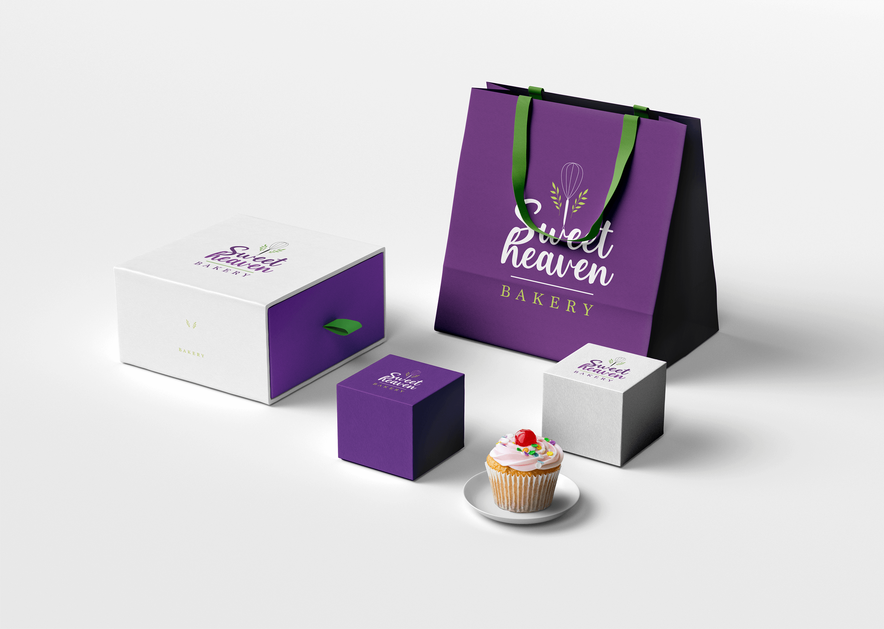
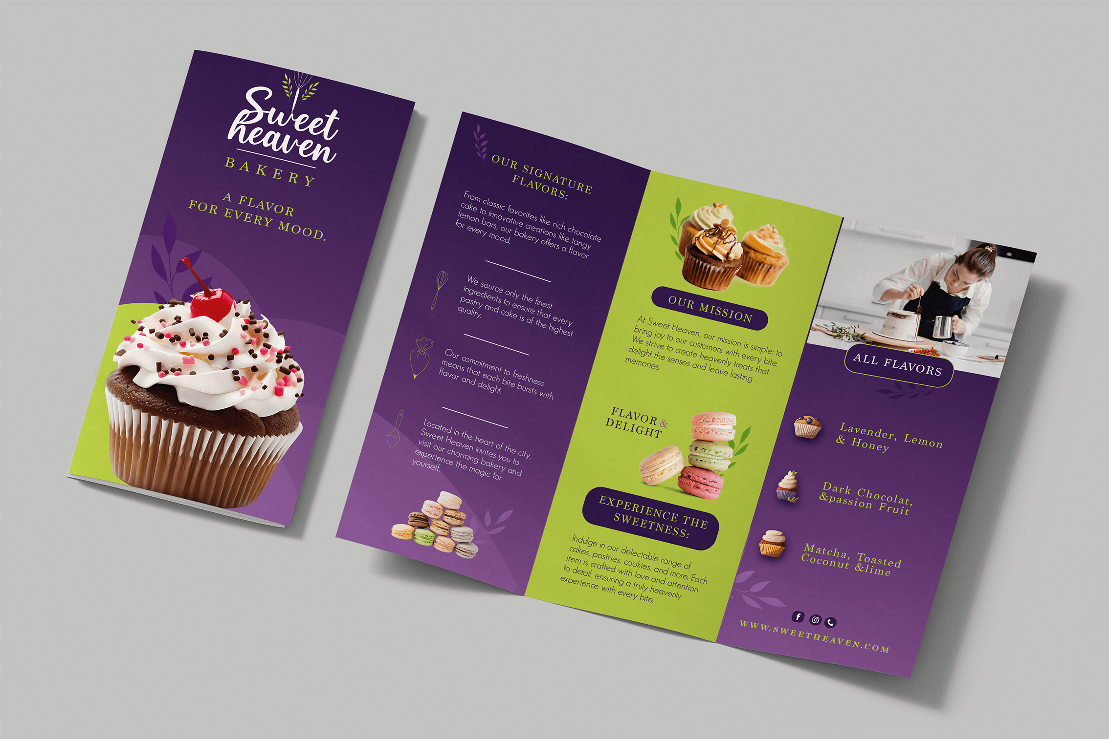
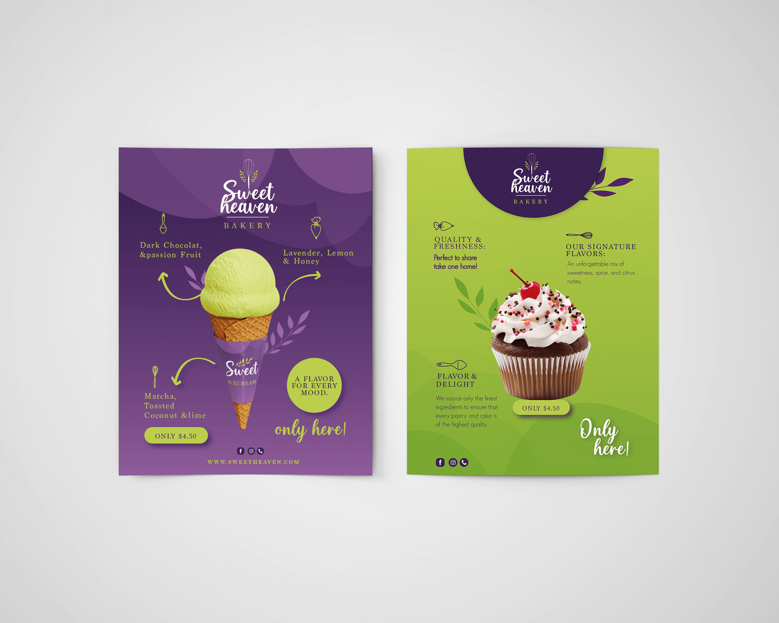
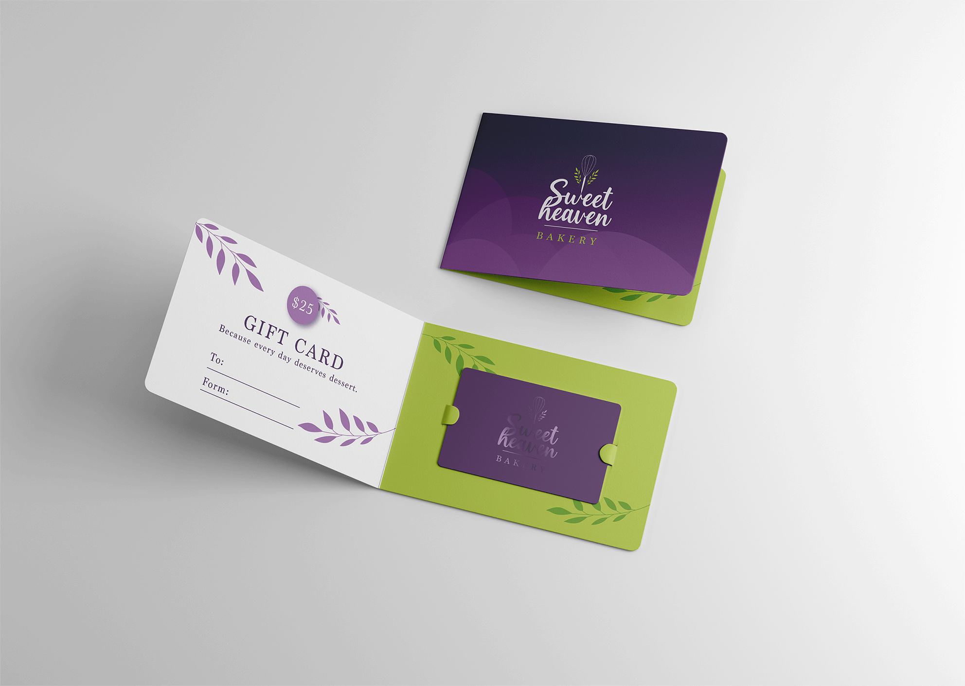
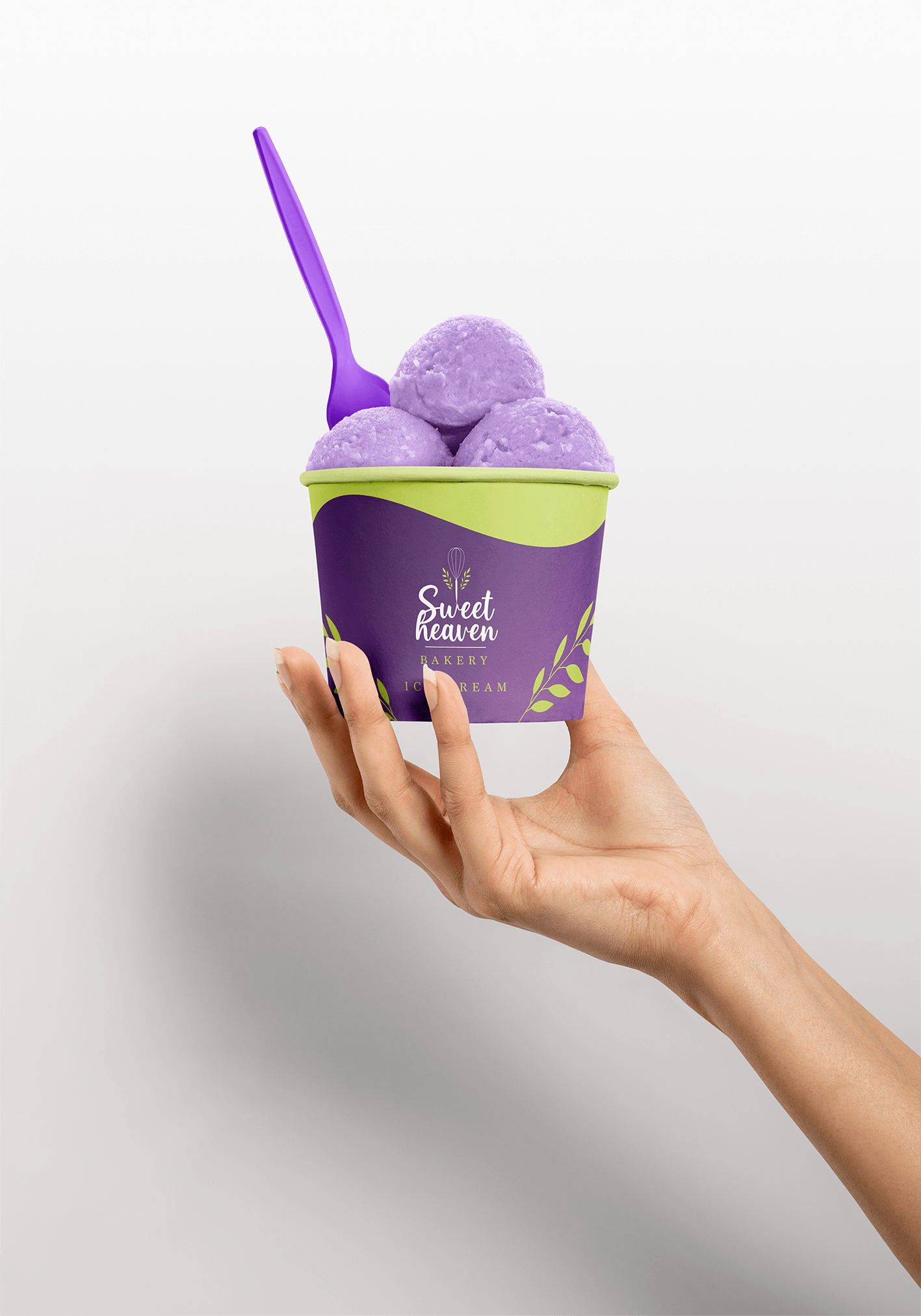
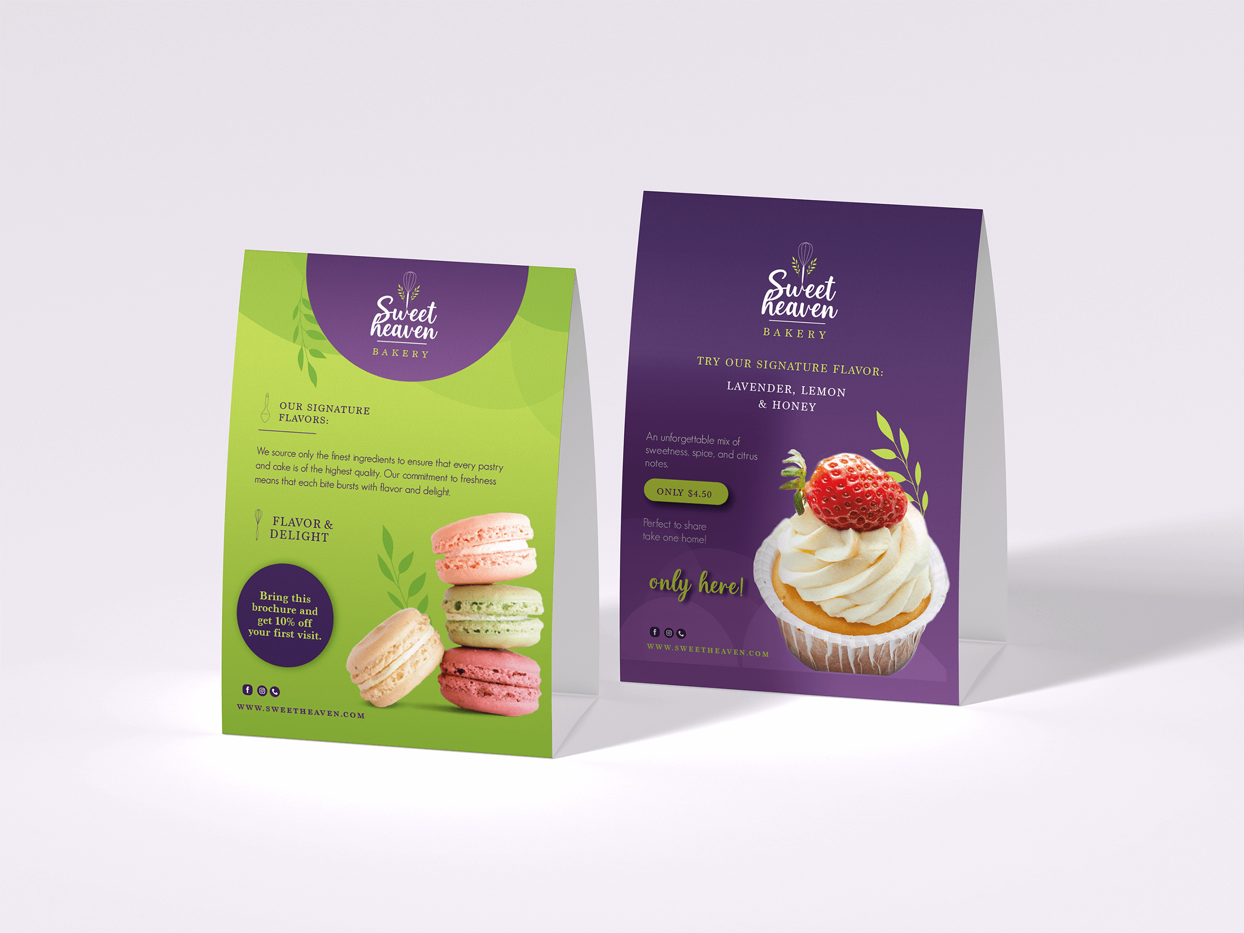
Sweet Heaven is a bakery that specializes in creating visually stunning and delicious treats.
Its identity reflects softness and elegance, combining pastel colors, delicate shapes,
and a warm, inviting style.
The branding work focused on making Sweet Heaven stand out with consistent packaging, menus,
and promotional materials, giving customers a memorable brand experience.
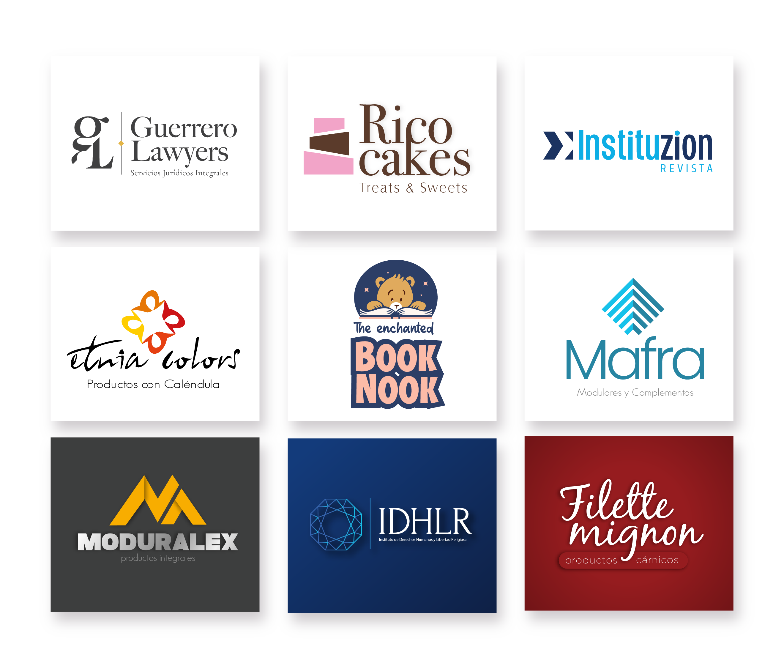
This logo collection showcases a range of visual identities designed for businesses in various sectors, including food, publishing, legal services, and furniture. Each logo was crafted to reflect the unique personality and values of the brand, ensuring clarity, memorability, and versatility across different applications.
The design process involved thorough research, concept development, and refinement to create distinctive and cohesive brand marks. From playful and friendly illustrations to elegant and corporate styles, this collection demonstrates versatility in adapting to different brand voices and audiences.
These logos were created using professional design tools and principles of balance, typography, and color harmony, resulting in timeless and adaptable identities.
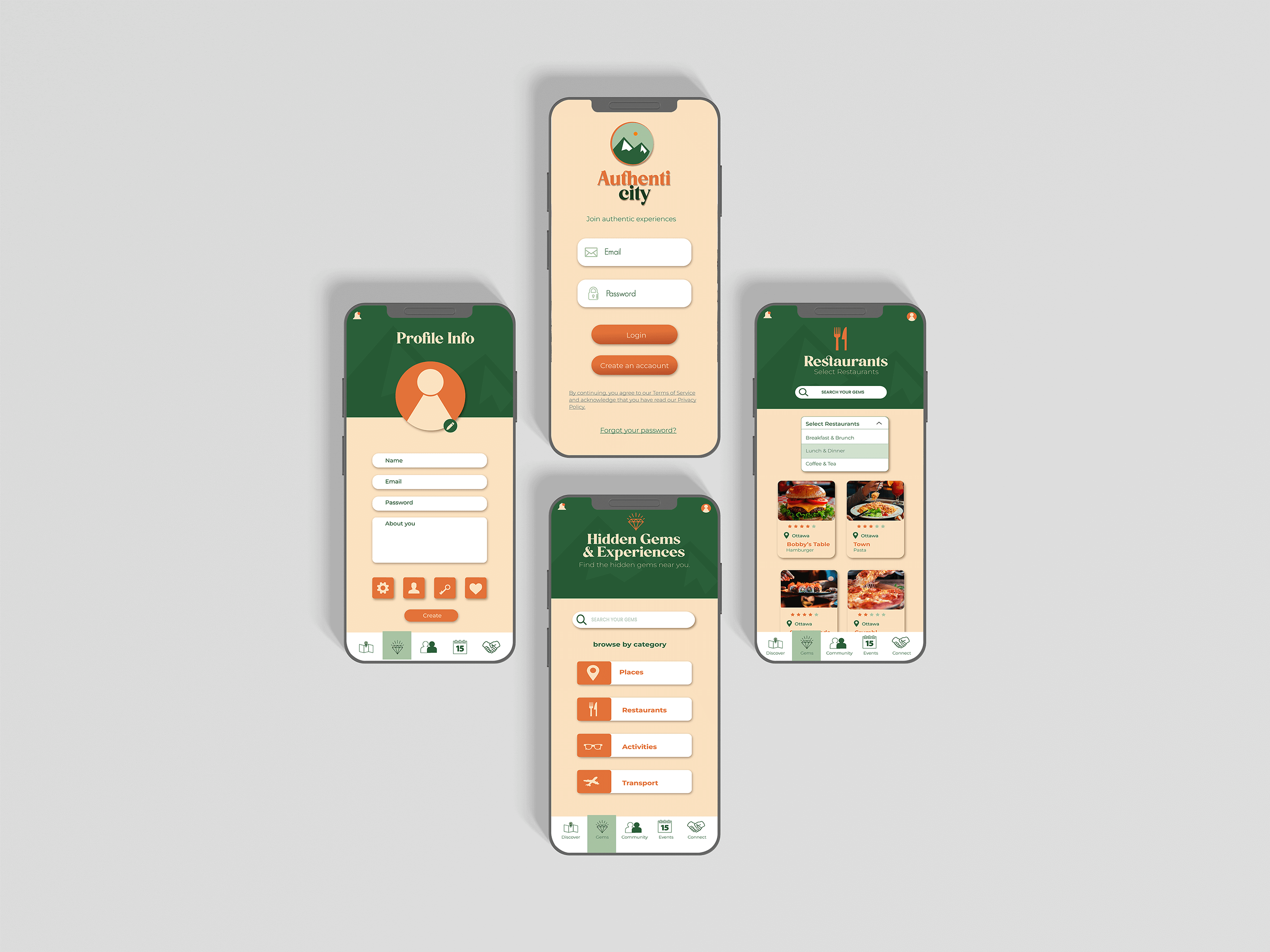
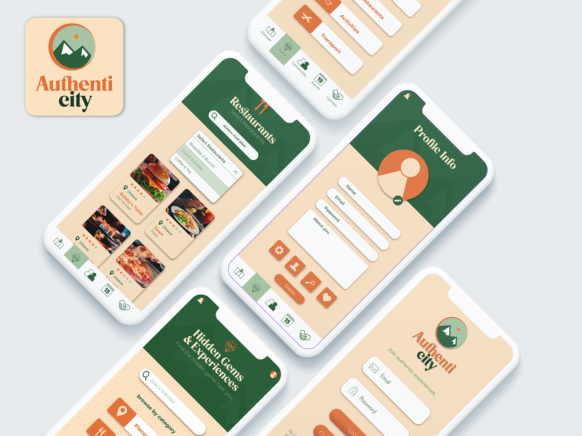
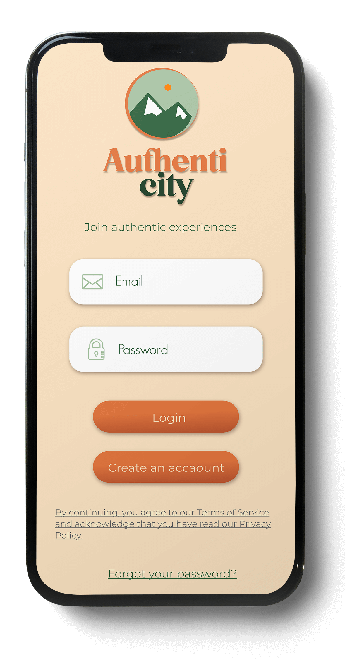
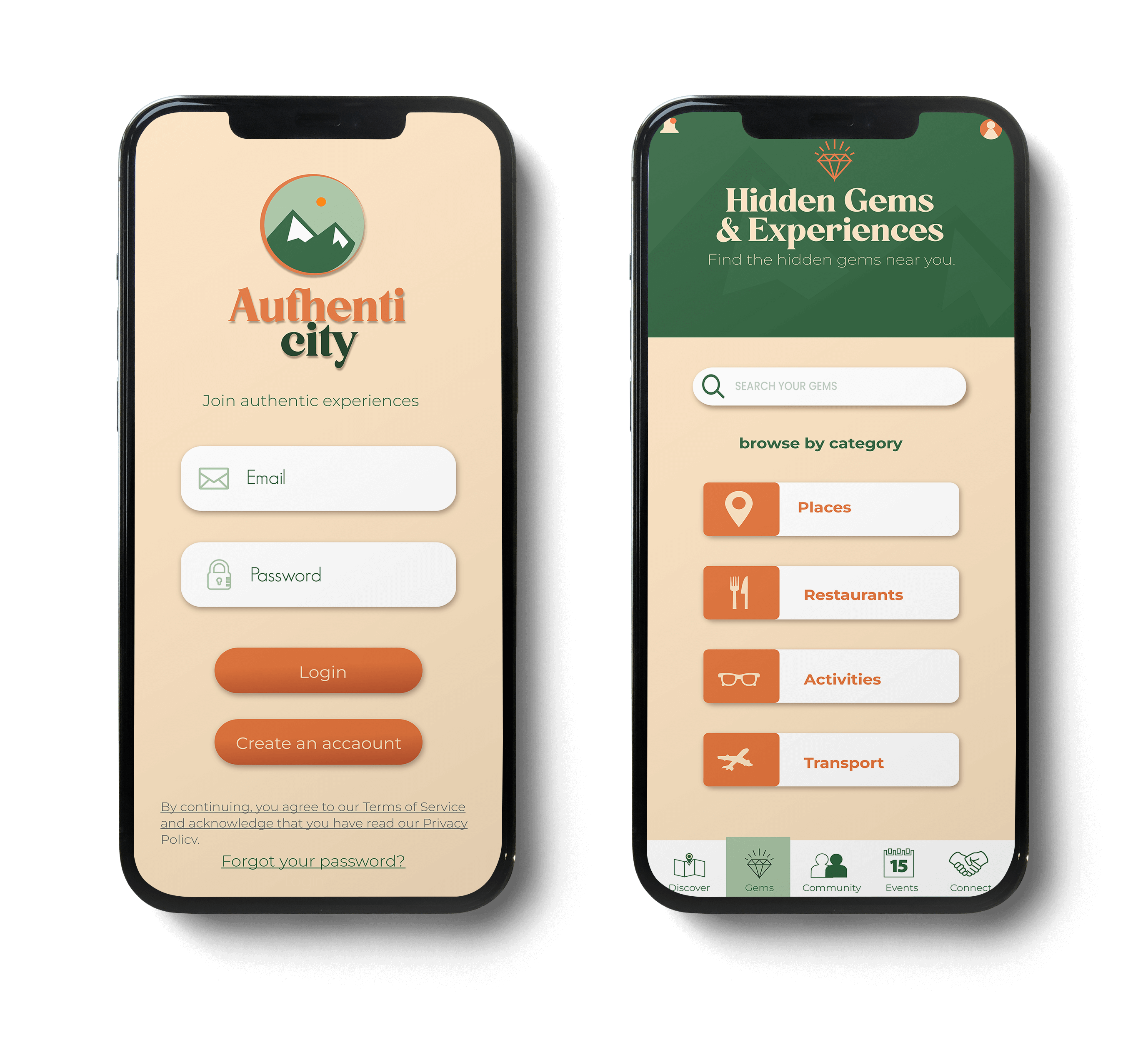
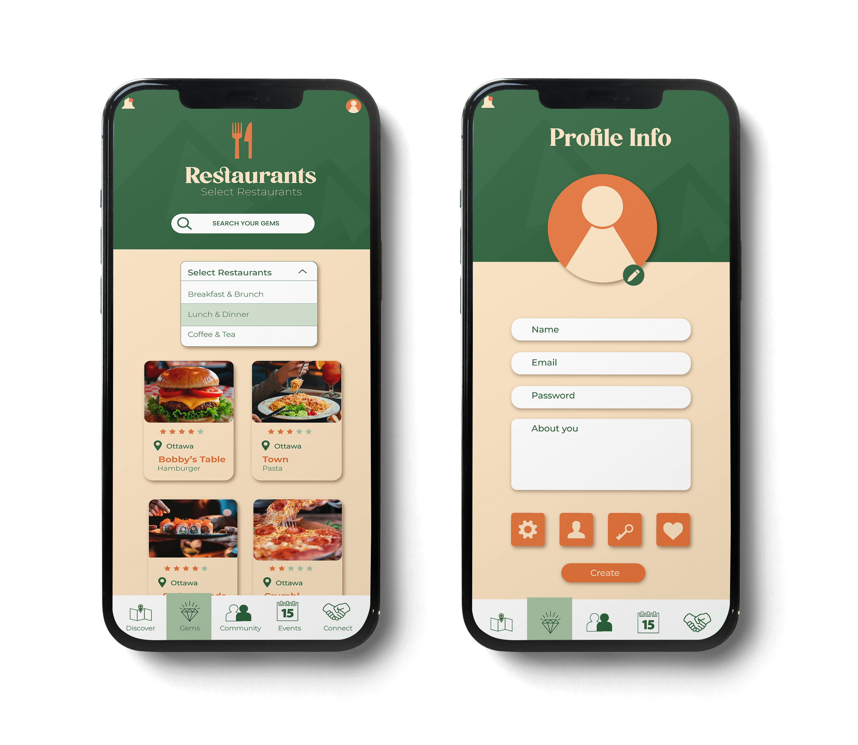
Authenticity is a school project developed as part of the Interactive Media Design program. The app was created with the idea of helping both travelers and locals discover hidden gems, authentic experiences, and unique events in their city. Unlike typical travel guides, Authenticity focuses on meaningful connections and community recommendations.
Users can build a personalized profile that includes travel history, interests, connection preferences, and languages spoken. This makes it easier to receive suggestions tailored to their personality and lifestyle. Through an intuitive design, the app allows browsing by categories such as places, restaurants, and activities, making the exploration experience simple and engaging.
The main goal of Authenticity is to go beyond standard tourist attractions and offer a space where people can connect with local culture, explore new environments, and share experiences that feel genuine and memorable. It highlights the importance of discovering not just a place, but the people and stories that make it special.
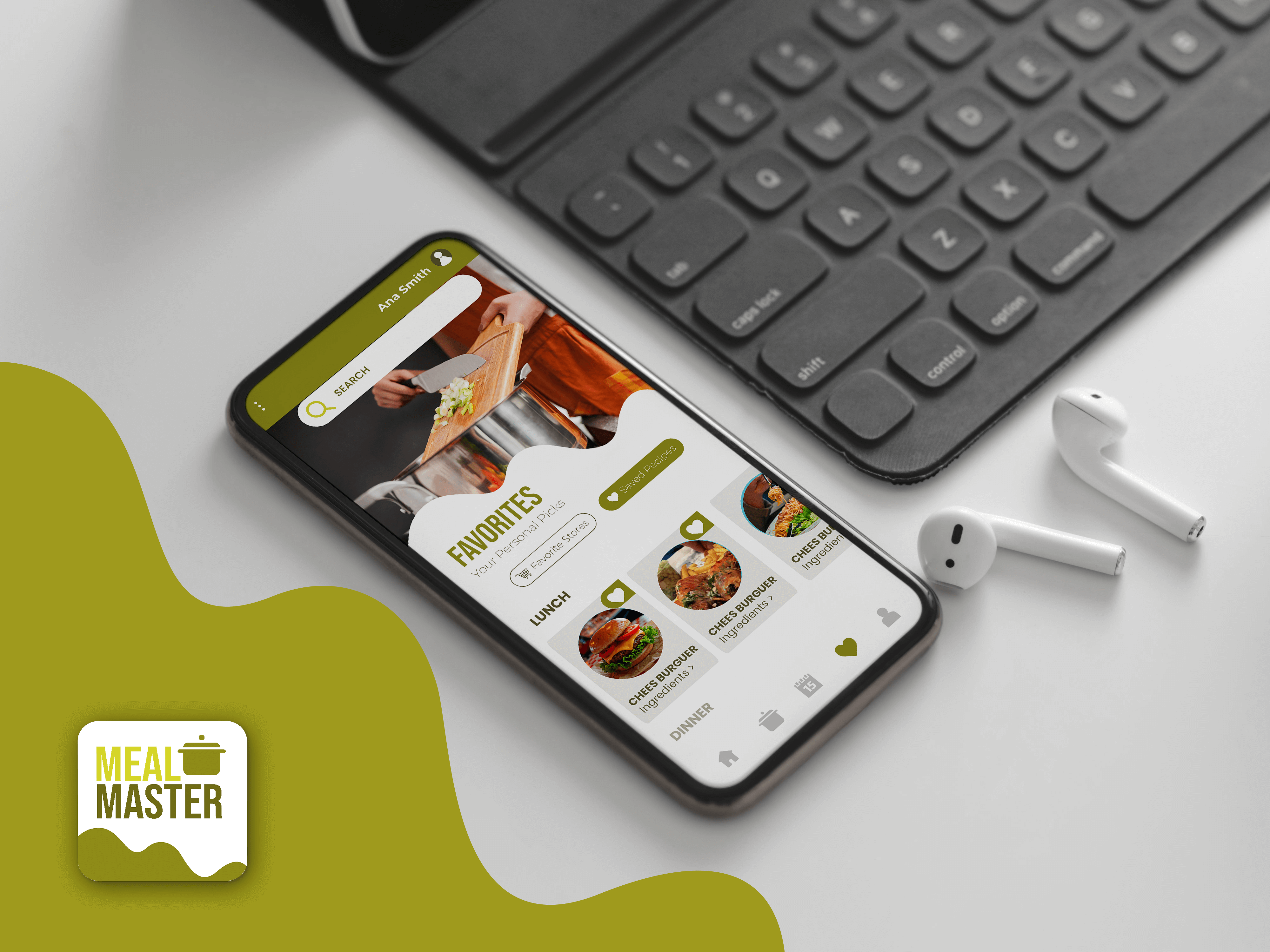
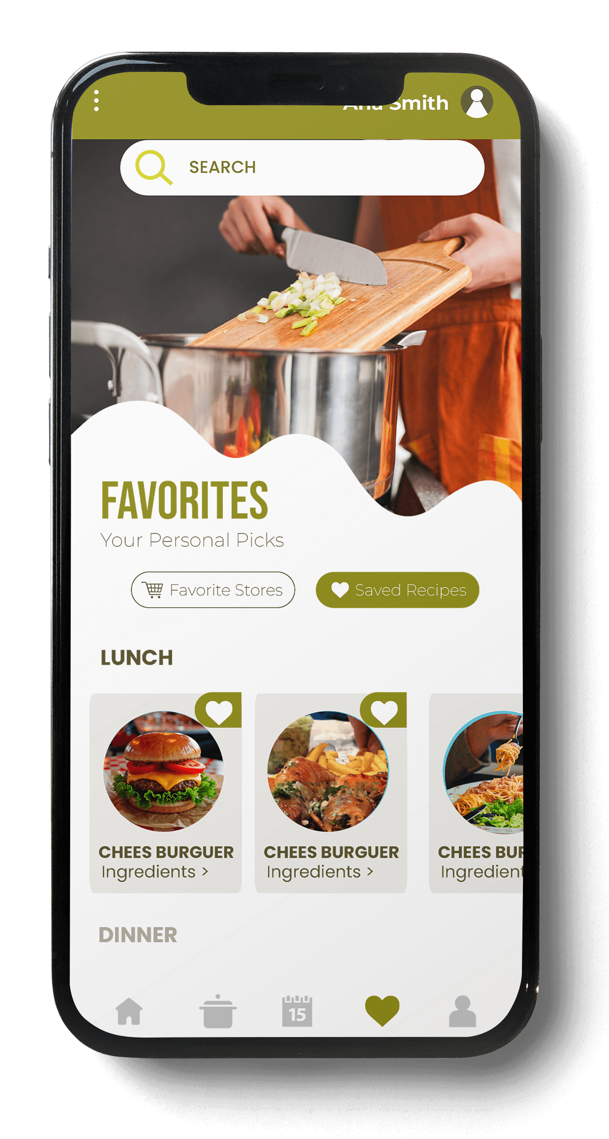
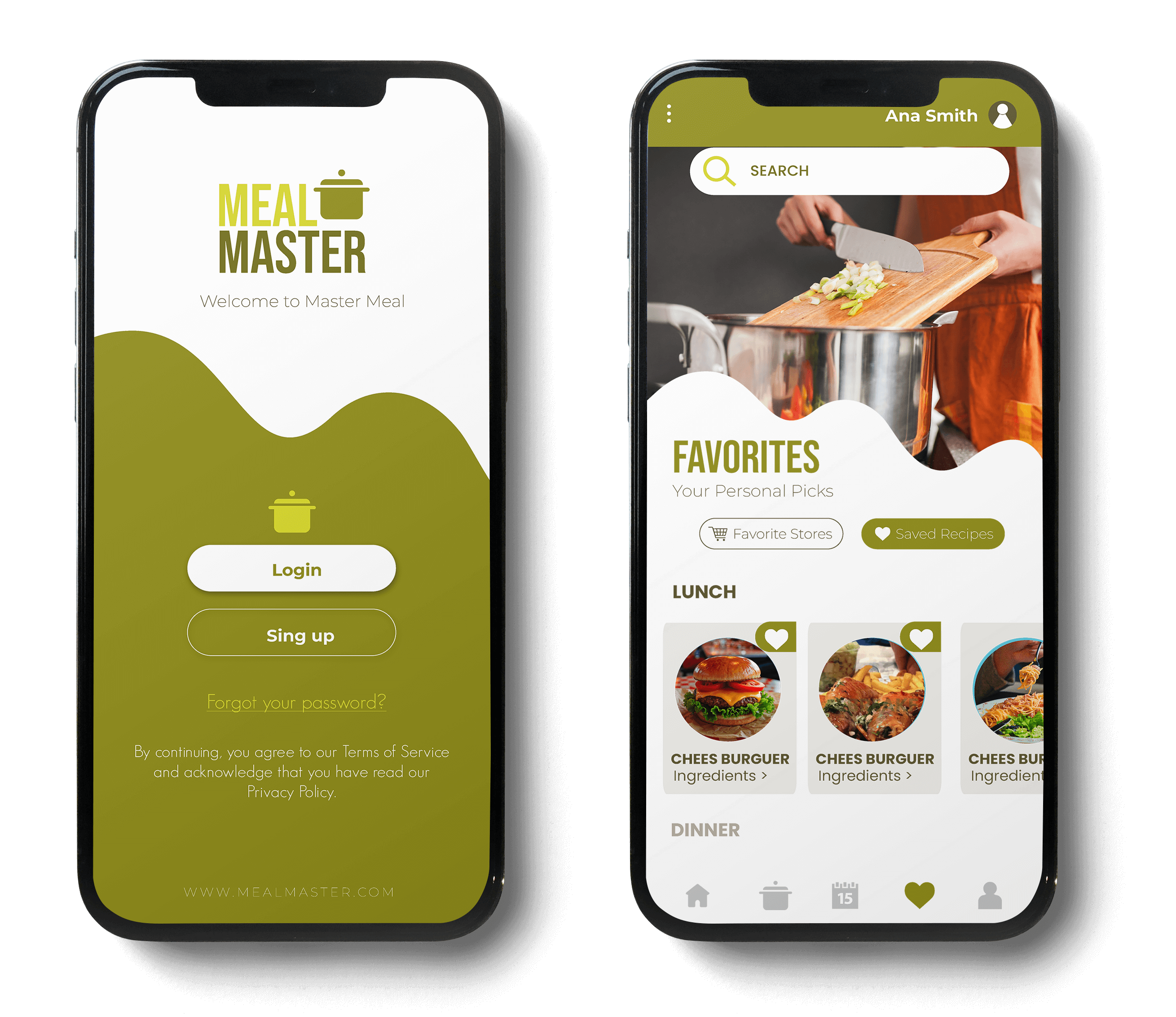
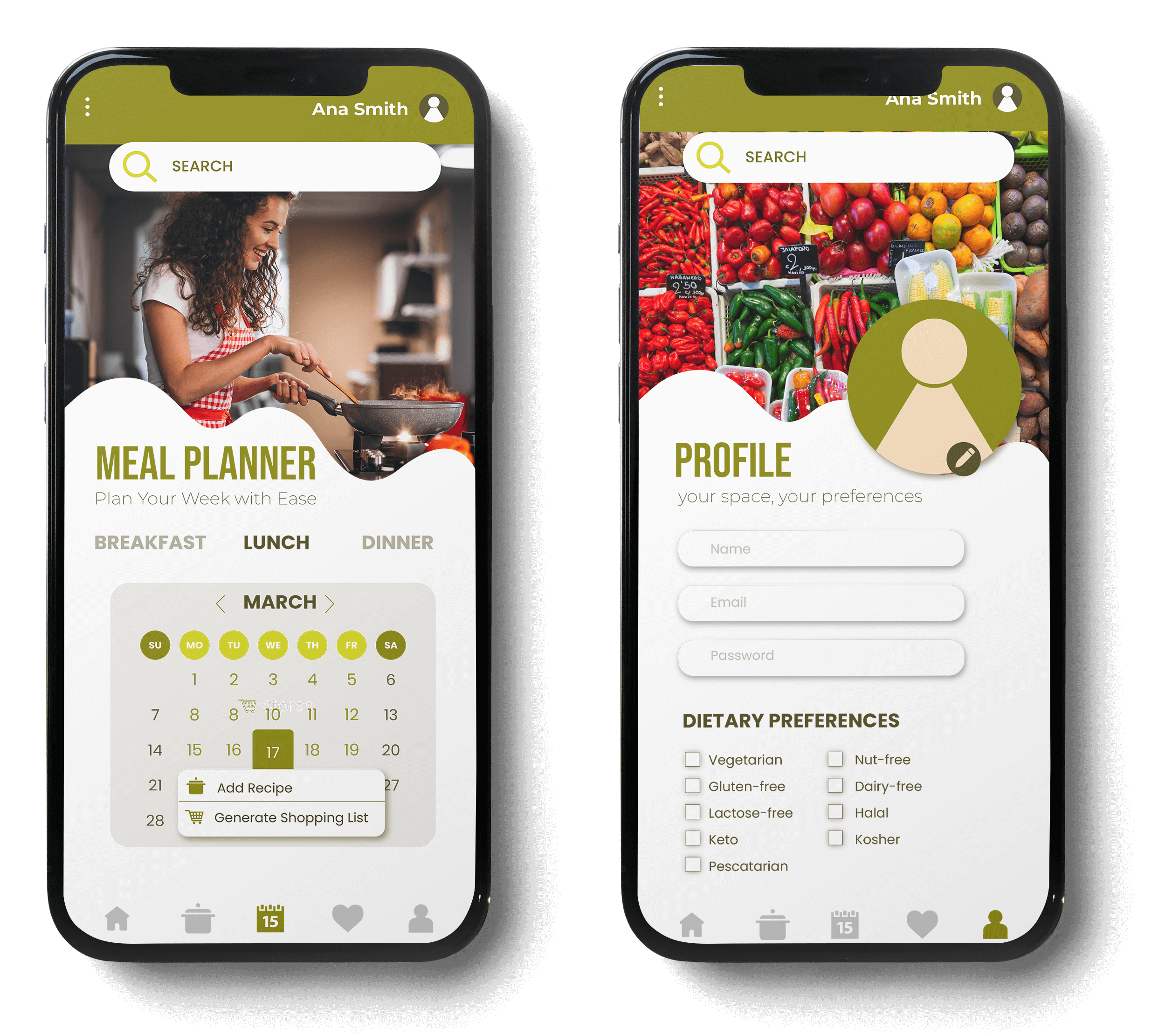
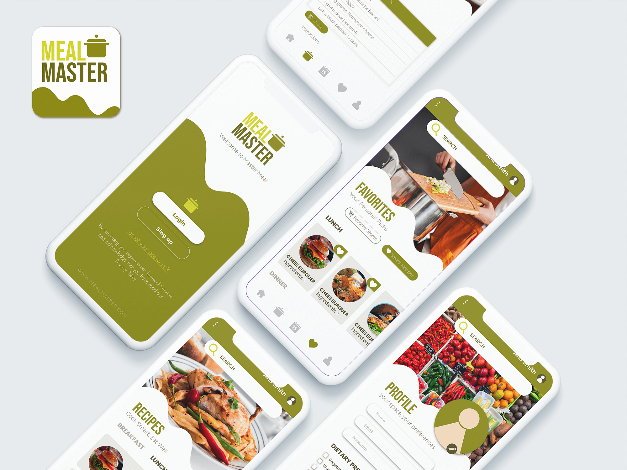
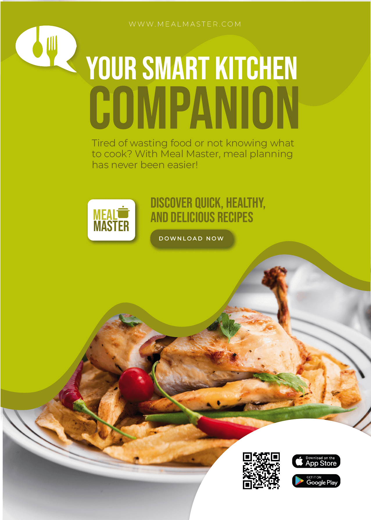
Master Meal is a school project designed to help users find great deals on groceries while also encouraging healthier eating habits. The app combines two essential aspects of everyday life: saving money and maintaining a balanced diet.
Through its simple and user-friendly interface, Master Meal allows users to access weekly promotions from local stores and quickly compare prices. Beyond saving, the app also features a recipe section that transforms affordable ingredients into delicious and nutritious meals, showing how healthy eating can be both accessible and budget-friendly.
objective of Master Meal is to create a practical tool that makes shopping and meal planning easier for individuals and families, while also promoting smarter consumption habits. This project reflects the integration of design, functionality, and user experience to address real-life needs in a meaningful way.